Rule of Three is a concept suggesting that a trio of anything (characters, objects, words, etc.) is more memorable or effective than other numbers.
“Omne trium perfectum”
– Latin phrase, meaning ‘Everything that comes in threes is perfect’ or ‘Every set of three is complete’
Why Three?
The answer lies in cognitive science. A study conducted by the Ohio State University has shown that our brains are constantly seeking out patterns, because it makes learning and remembering easier.
Humans are both neurologically and culturally adapted to the number three, because it’s the smallest number required to make a pattern and has been used for centuries, whether we realise it or not.
In fact, some of history’s most powerful ideas have been conveyed with this principle in mind, dating back as far as the year 47 BC when Julius Caesar used the famous phrase “Veni. Vidi. Vici.” in his letter to the Roman Senate (meaning: ‘I came. I saw. I conquered’).
Once you recognise this structure and start looking for it, you’ll see that it’s everywhere.
- In physics: three states of matter: solid, liquid, gas / Newton’s three rules of motion
- In religion: the concept of triple deity e.g. Holy Trinity
- In photography: rule of thirds (dividing an imagine into three parts vertically and horizontally)
- In history: “Liberté, égalité, fraternité” (national motto of France, meaning ‘liberty, equality and fraternity’)
- In writing: Three Little Pigs / Goldilocks and the Three Bears
- In storytelling: used a structural tool – beginning, middle, end or setup, confrontation, resolution
- In slogans: Stop, drop and roll. Slip-slop-slap.
Rule of Three in Property Styling
Even numbers create symmetry, odd numbers create visual interest.
In home staging, we see the Rule of Three more as a guideline and less than an actual ‘rule’ per se.
The reason is quite simple. If we were to arrange everything into structures of threes, it would feel too erratic and asymmetrical, confusing the brain about where to look and what to do, sending the eye scampering all over the place.
To find the right balance between the ‘overly structured’ and the ‘disorganised’ look, we need to combine both – odd and even numbers, using the Rule of Three as an accent feature.
Rule of Three in Furniture Placement
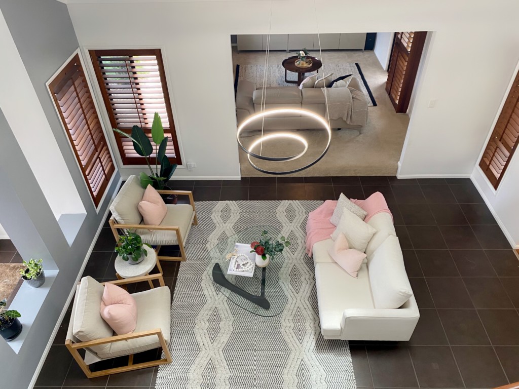
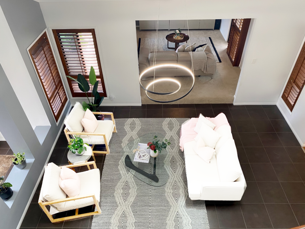
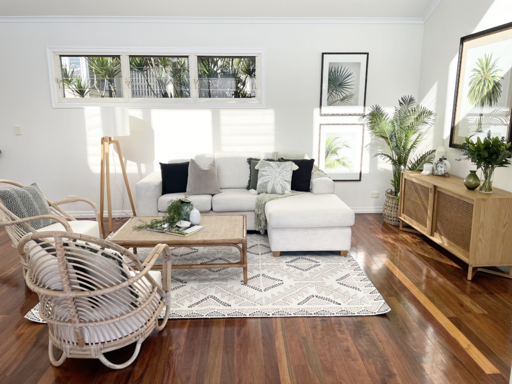
In most of the properties we style, we bring in one sofa and two armchairs. This furniture combination creates an inviting and family-friendly conversational space.
There are some exceptions of course, for example when we are limited on space (we only use one armchair), or when the house has multiple living areas (in which case we like to change up the furniture placement in each living area – e.g., conversational, media, lounge, etc.).
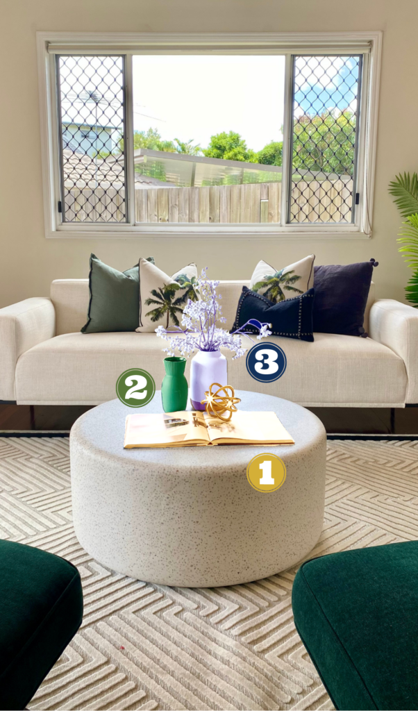
Cluster Up the Accessories
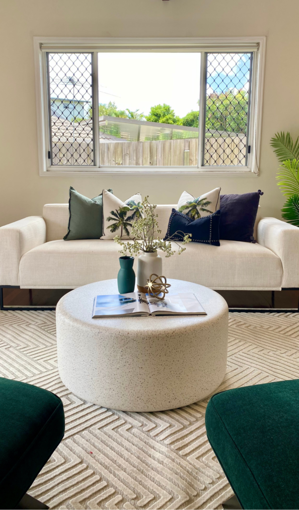
It’s important to highlight that the rule of three does not apply to three individual décor items. We are talking about three clusters of decorations. These clusters are usually arranged by their height, which brings us to the next point – the magic triangle.

The Magic Triangle
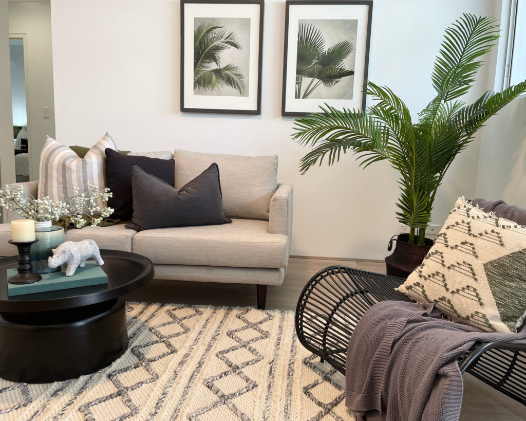
This is probably the most important rule of them all when it comes to styling spaces where the decorations are grouped together in one spot. Create a visual triangle. Make sure the tallest décor items are at the back, the medium ones in the middle and the smallest at the front.

Trio of Colours
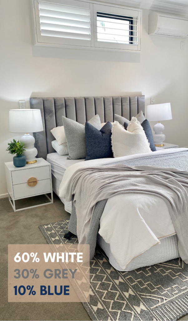
The 60-30-10 rule from Maria Killam is a helpful guide if you are not sure where to start with colours.
The rule states:
60% main colour
30% secondary colour
10% accent colour
For us at Foxy, this is not a rule we religiously stick by. The colours we pick are based on the style we choose, and some styles require a few more colours than just three. But it is a good illustration of how the Rule of Three extends beyond “just decorations”.
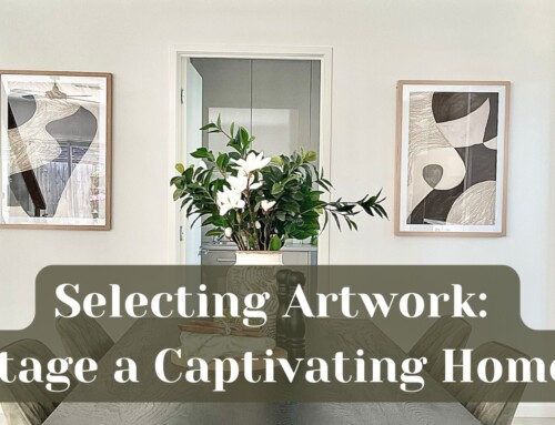
Artwork Triplets
When it comes to hanging artwork in homes for sale, we prefer to do pairs instead of triplets to keep the number of holes in the walls to a minimum.
Some properties have a limited space on the walls, for example this one (pictured below) had beautiful floor-to-ceiling windows facing the sofa, so we’ve decided to hang a trio of matching artworks close to each other and it came out looking great!
Test Yourself!
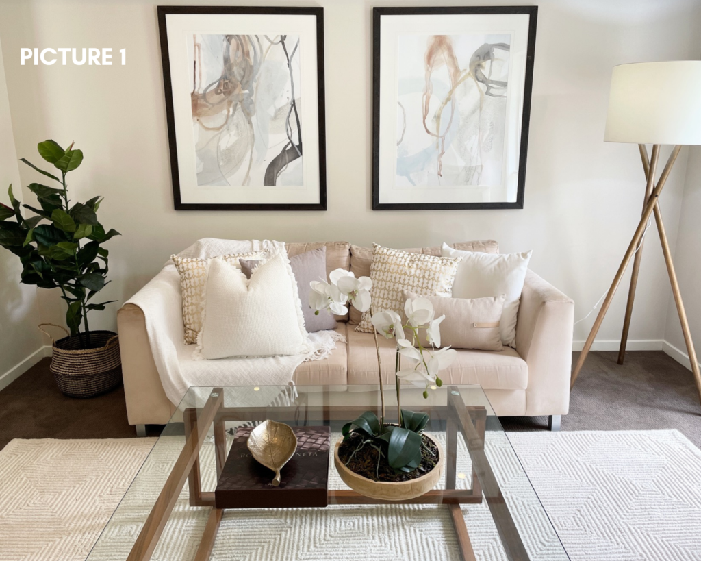
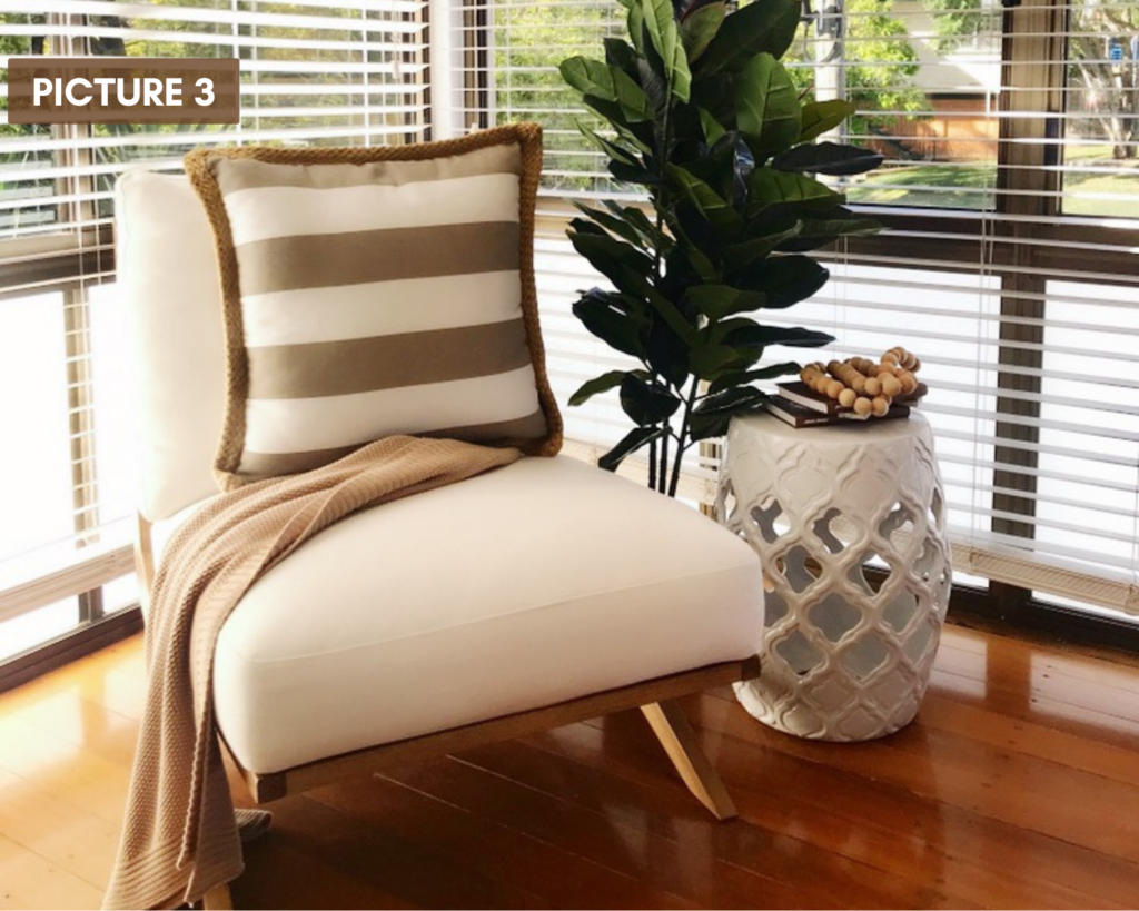
Let’s put your new knowledge to test! How many Rules of Three do you see in these pictures?
HINT: There is more than one in each! 🙂

Thank you for reading!
For more home styling related content, follow us on Facebook, Instagram or watch our Youtube Channel!
—
Correct Answers:
Picture 1: accessories on the coffee table, cushions, tripod floor lamp
Picture 2: furniture placement, accessories on the coffee table, decorations on the buffet
Picture 3: three items in the picture (armchair, bedside table, plant), decorations on the bedside table





Facebook Comments