Karate-Chop and 3 Other Weird Things our Stylists Do
Get into the stance. Legs wide. Arm high. Breathe in. Breathe out…. and… “Kiai!”
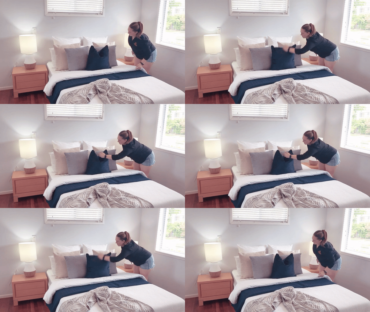
No, this is not an excerpt from a karate book. It’s just our property stylists chopping cushions.
Yes, cushions.
Why would they karate-chop cushions, you may ask. Well, here’s a few reasons why.
• It accentuates the texture of the fabric, which contributes to sensory stimulation. (This topic could be a lengthy blog post, but long story short – appealing to the senses of potential buyers creates a more memorable experience)
• It makes the pillow appear more plush, which people associate with opulence & luxury, increasing the perceived value of the house.
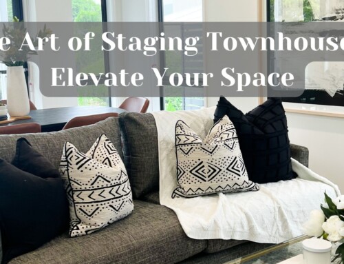
• It looks more comfortable and homely. Have a look at the pictures below, don’t you just feel like jumping right in?
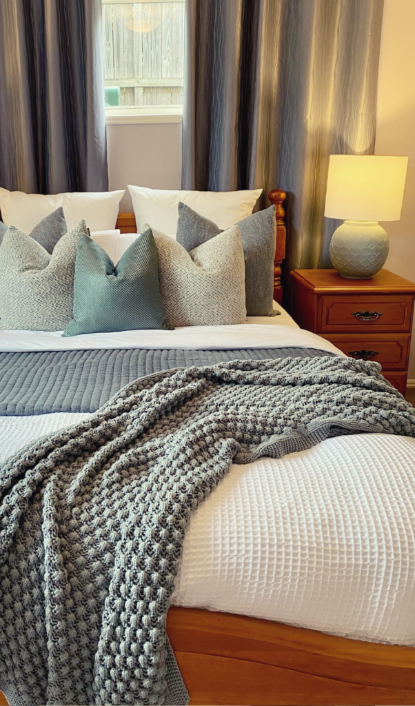
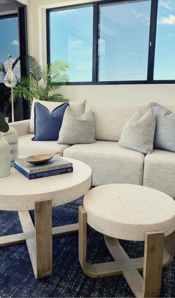
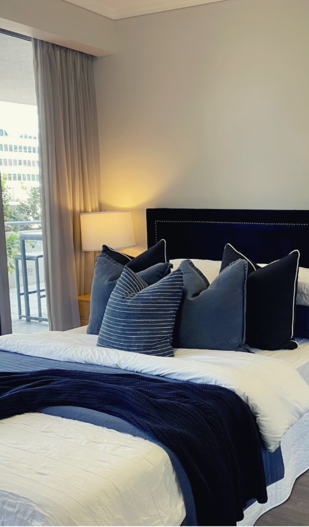
If you want to create this look for your home, we recommend using good quality feather-filled cushions that retain the dent from the karate chop. We love shopping for “choppy pillows” (as we call them) at Adairs.
If you are looking for a more budget-friendly option, here’s an article we wrote on this topic, incl. our list of favourite shops and other tips & tricks! – Read Here.
—
Can anything get ‘weirder’ than karate-chopping the cushions? Well, you be the judge. Here are three more things that our girls do, that makes clients and agents go from scratching their heads to nodding in approval.
1. They never let the sofas touch the wall.
—
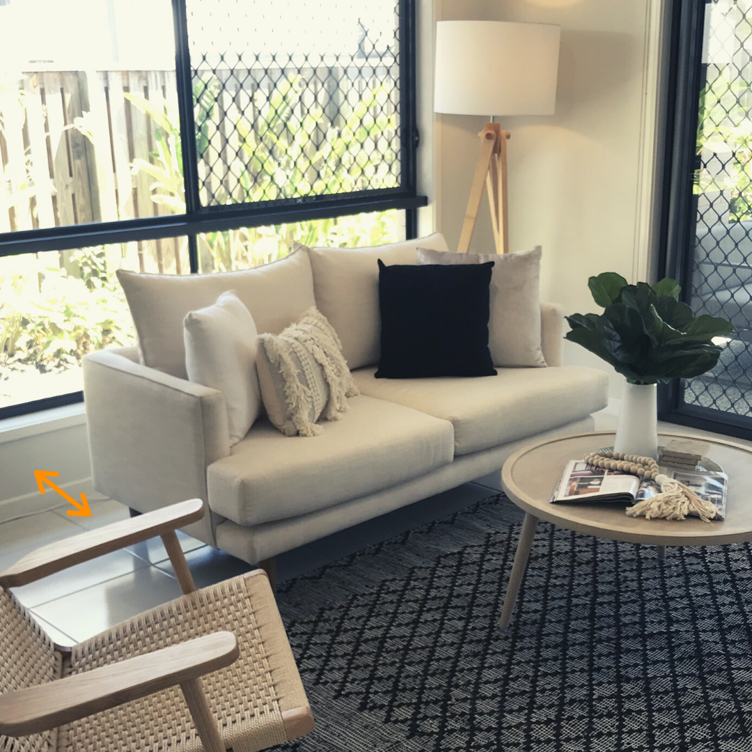
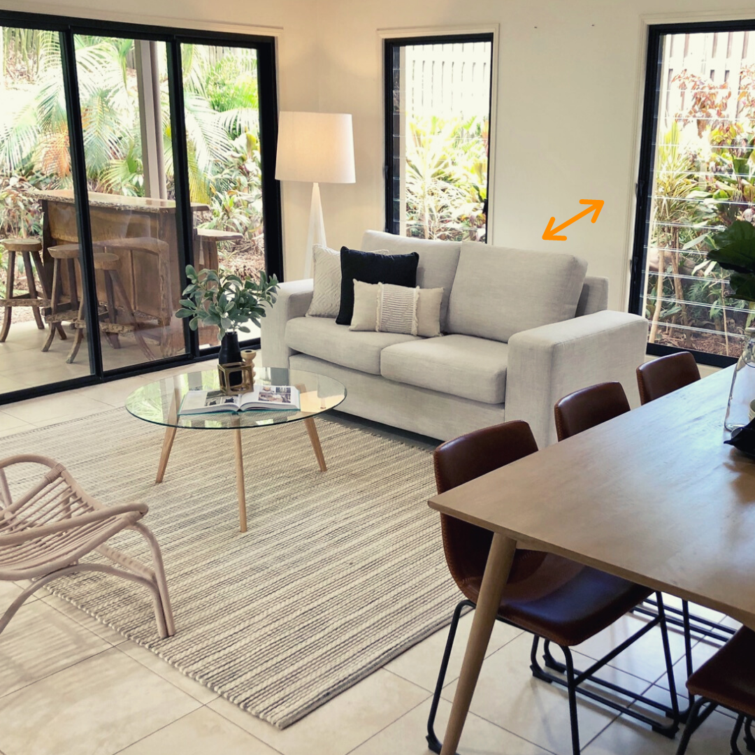
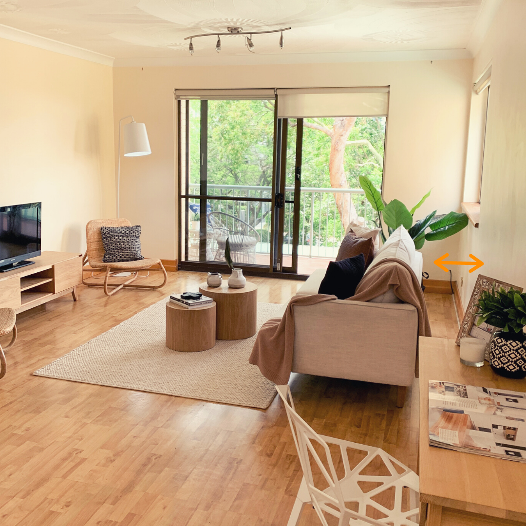
It may seem counterintuitive, but keeping the sofa 30-90cm away from the wall makes the room appear bigger.
How is this possible? The secret lies in our depth perception.
The narrow walkway and shadows casted by the sofa create an illusion of spaciousness, tricking our visual senses into thinking the room looks more open, therefore bigger.
2. They hang the artwork without a measuring tape.
—
Our stylists take a large toolbox with them everywhere they go, but you would not find a single measuring tape or a bubble level in there.
(If you want to know what they pack in the install box, click on the picture or here)
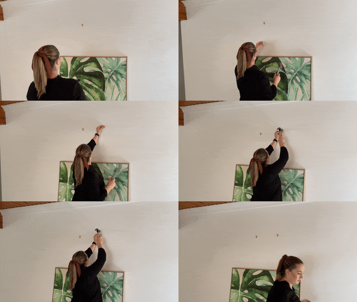
The reason is quite simple. They find the best artwork position by eyeing the room, rather than by taking on a mathematical approach and measuring the exact centre of the wall. This is best executed when all the furniture is in place, so they can get a feel for the best placement of the art.
—
If you are a bit OCD (like me), watching this unfold for the first time may be a bit uncomfortable. Our stylists put the artwork on the ground, leaning it against the wall they want to hang it on. Then they take a few steps back, tilt their head left, tilt their head right, pick a spot and without much hesitation hammer the nail in. And then the second one.
—
Want to know the best thing about this? 99.9% of the time it looks absolutely perfect.
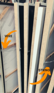
TIP: We have attached a string or a wire on most of our artwork, that way we can easily adjust the positioning of it by tilting it right or left.
3. They position sofas facing away from the TV (sometimes).
—
Wait, what? The sofa is not facing the telly? Such an unimaginable concept to us, Australians…
But this is where it truly shows that Home Staging is not about practicality, it is about the look and feel we bring into the house.
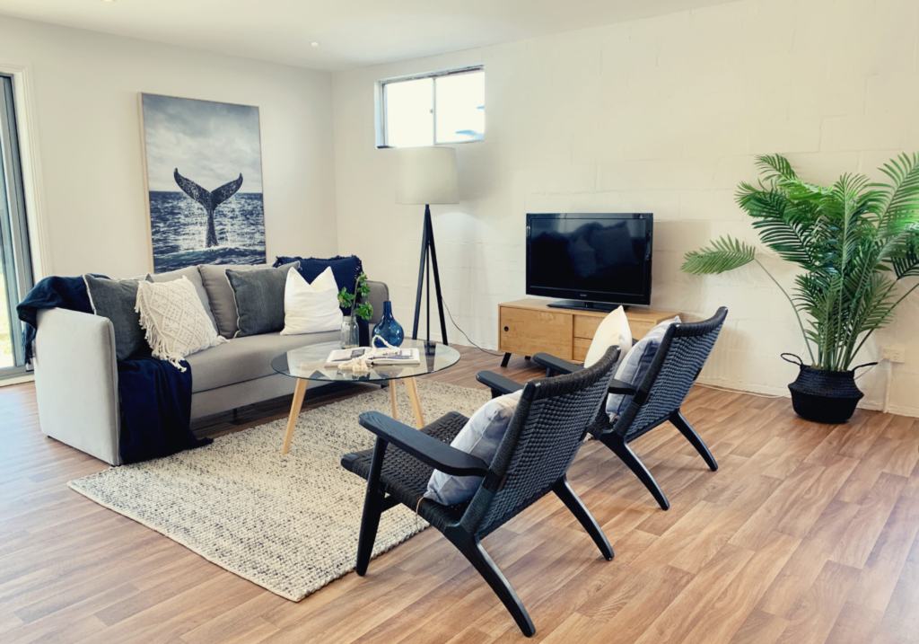
Our stylists have a lot of rules they adhere by, one of the main ones being ‘Never allow people to walk into the back of the sofa’. Seeing the back of the sofa creates friction, appears uninviting, makes the room look smaller and is difficult to photograph.
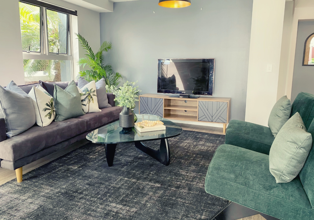
In some houses, the placement of the sofa seems obvious, but in others it may be a bit more tricky.
Especially in open-plan-living areas, large living rooms or other unusual layouts, there is simply no way we can position a sofa facing the TV, without creating a visual disbalance.
That is why in these cases we create a ‘Conversational Space’ with TV at the wall, present purely for the entertainment aspect.



Facebook Comments