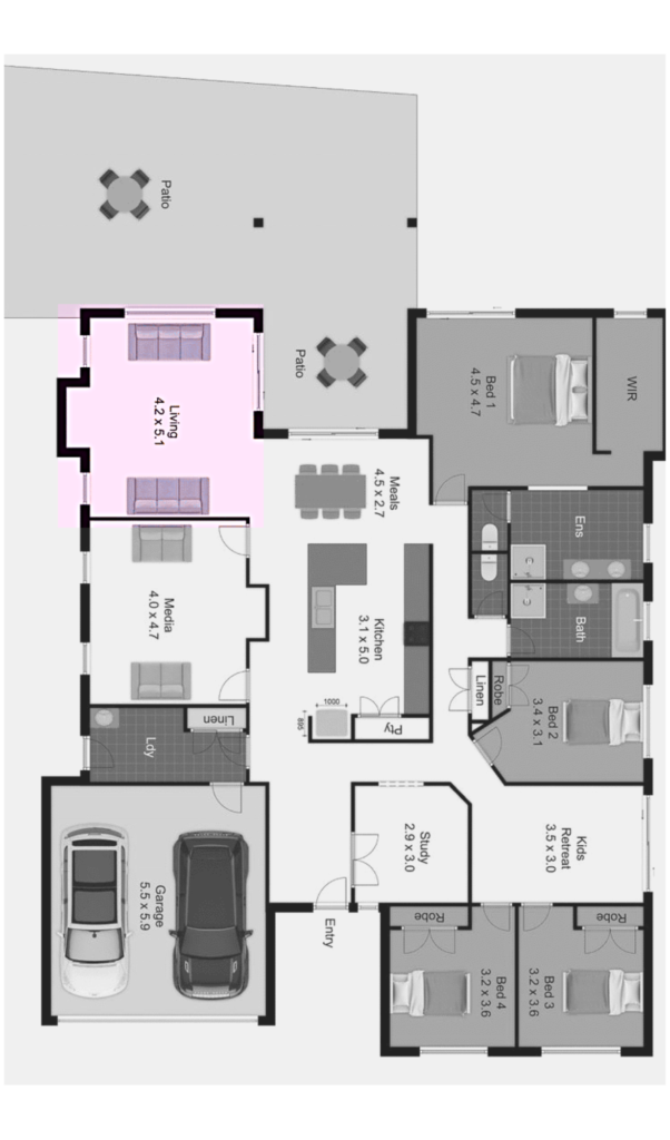
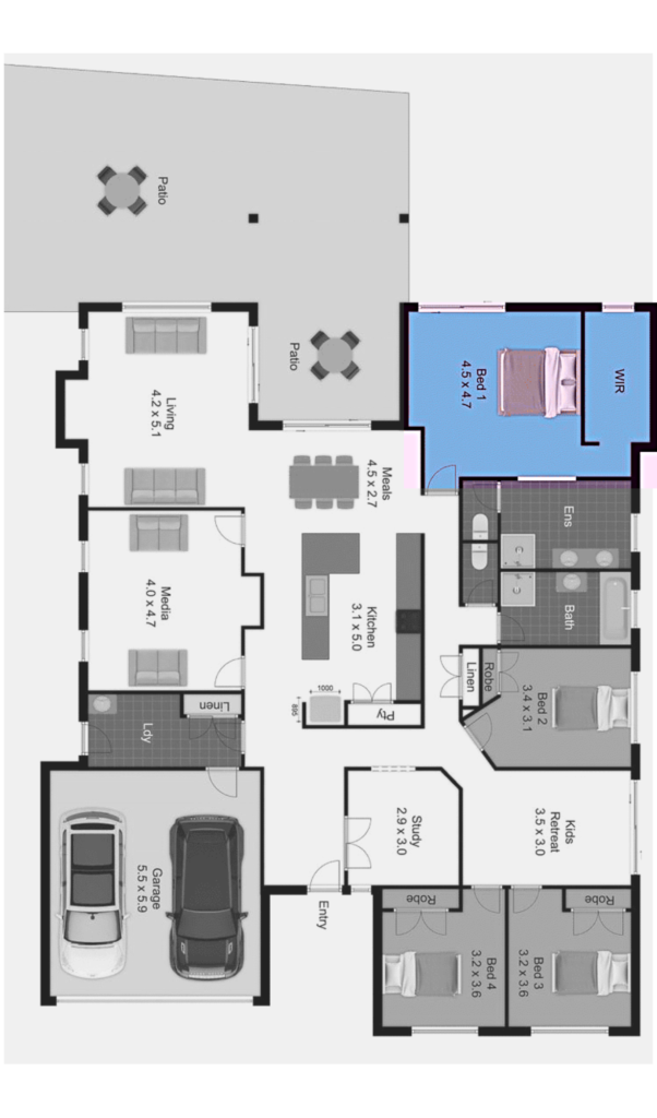
As Home Stagers, we see a lot of homes with similar layouts, but we never got to style two houses in different suburbs that had almost identical floorplans.
Until last week.
You may think ‘Oh, nice! That’s easy, just copy and paste!’, but there’s more to it than ctrl+C and ctrl+V. There’s a lot of things we need to take into account before we choose the most suitable style. In this case, the most prominent influencing factor was the architecture of the homes.
39 Taffetta Drive
Mount Cotton
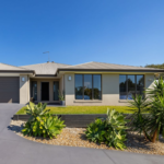
• “older” home that has been lived in previously
• coloured feature walls
• dark timber floors
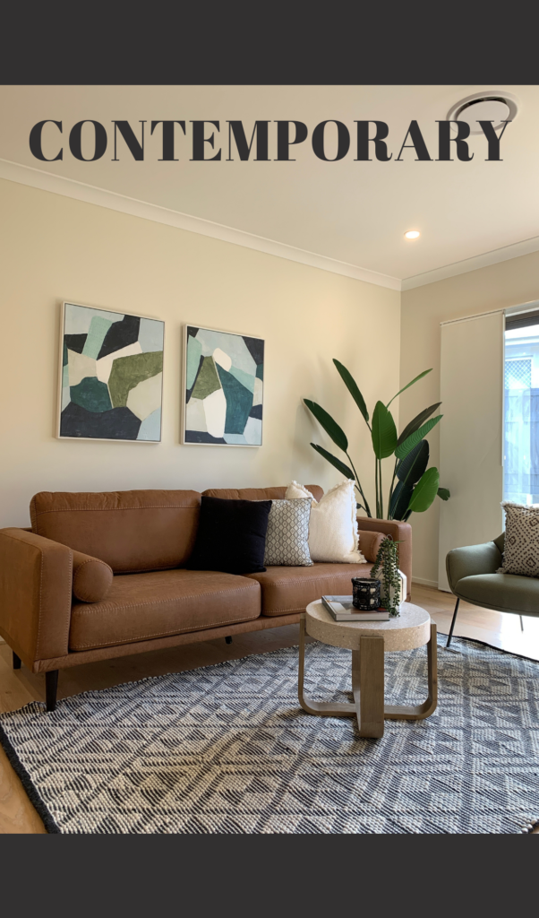
= TRADITIONAL STYLE
23 Randazzo Crescent
Augustine Heights
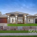
• ex display home, new built
• high-end finishes
• stylish built-in features
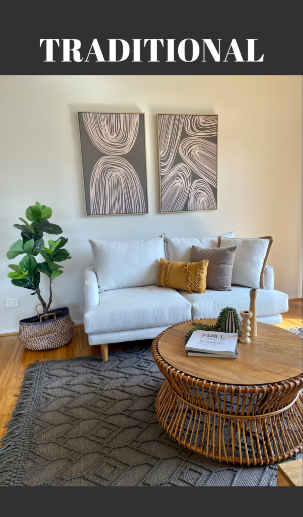
= CONTEMPORARY STYLE
Living Area
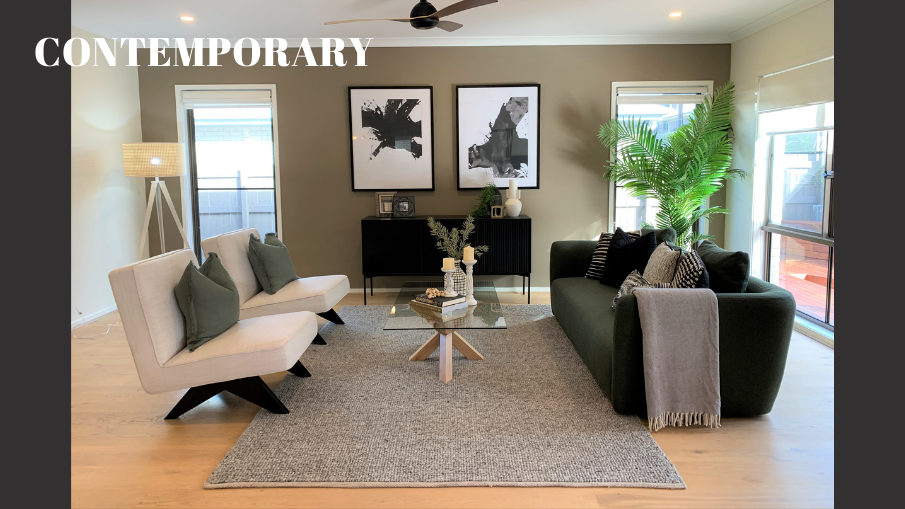
In the contemporary home – The living room had a sage green feature wall, which was the main source of inspiration for the complementing colour palette of our furniture. The green sofa is one of our favourites! Its unique, round shape is very trendy and gives the room a nice, relaxing ambience.
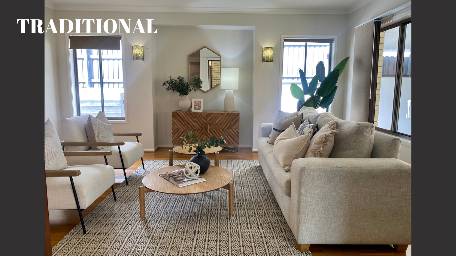
In the traditional home – The block-out curtains in combination with the timber floor made the room feel a bit dark, so we’ve gone with light-coloured furniture to brighten it up. Neutral coloured furniture is a great way to connect the living areas and secure a cohesive flow throughout the home, especially when there are multiple different-coloured walls.
Dining Area
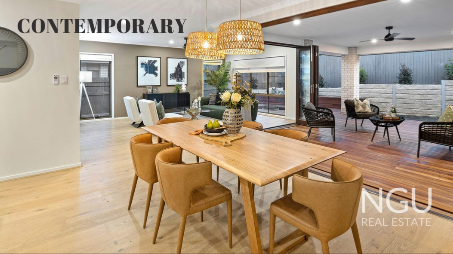
In the contemporary home – We wanted to make this area feel warm & homely, while still matching the overall modern design elements. Wooden surfaces and rounded edges are family-friendly features. The tan-leather chairs add a sophisticated addition to the look.
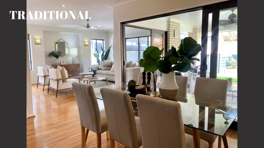
In the traditional home – We’ve chosen a glass-top dining table to reflect the light and therefore illuminate the space. Fabric chairs appear “cosy”, which matches the expectations of our target demographic of buyers – families.
Leisure Area
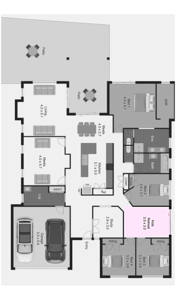
This space will most likely become a kids retreat or a playroom, considering it’s the room joining all three “secondary” bedrooms.
We’ve styled this space as Leisure Areas in both homes, mainly because scattered toys are not quite the look that sells 😊
Putting in a smaller sized sofa will still help the buyers ascertain the actual size of the space and simultaneously showcases it as a potential living room, which increases the perceived value of the house.
Media Room
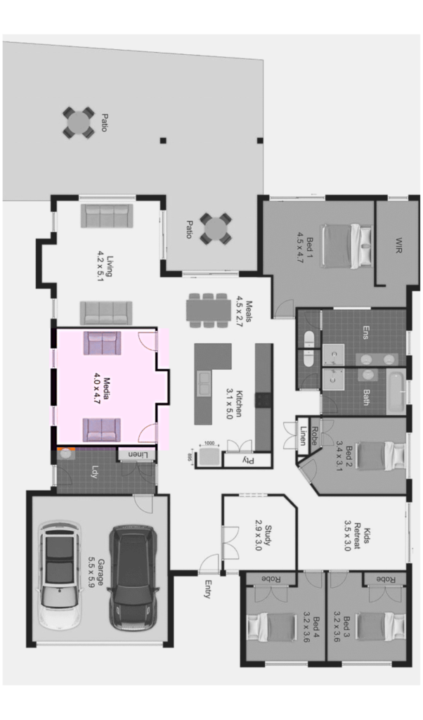
These two are probably the most different rooms when it comes to the furniture layout.
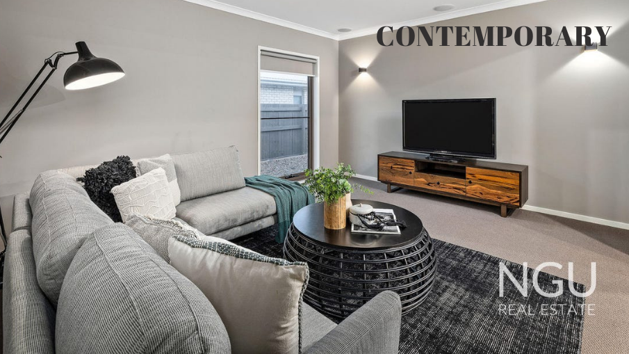
In the contemporary home – There was only one window in the corner of the room which has allowed us to bring in a large corner lounge. Modular sofas look comfortable and inviting, which is exactly what you want people to feel when they walk into a family entertainment area.
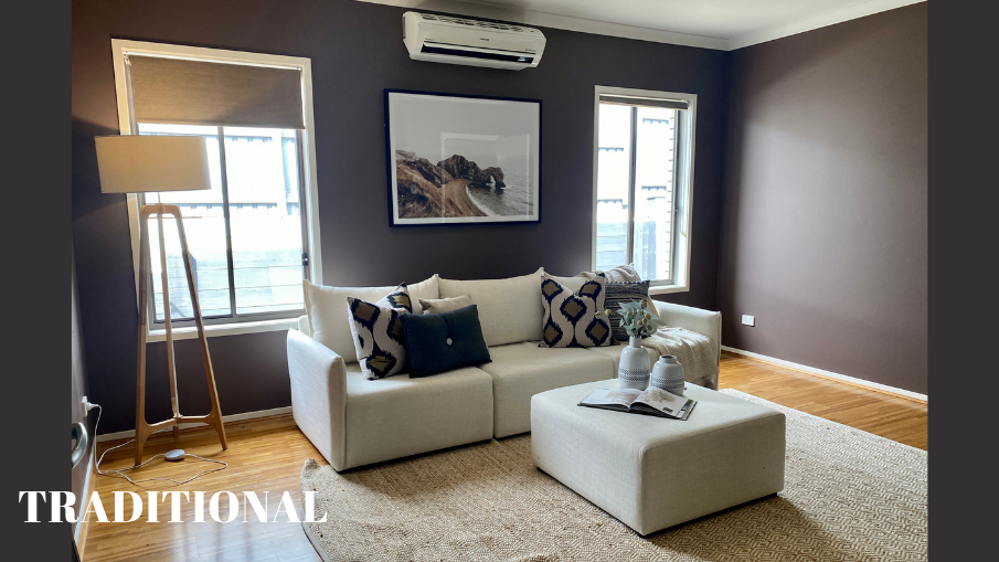
In the traditional home – The brown paint made the room look optically smaller and dark, which posed a challenge for us to make it appear bigger and brighter. That is why we brought in light-coloured furniture, rug and decorations, as well as a floor lamp for an extra source of light. To avoid covering the windows and preventing more natural light from coming in, we’ve decided to go with a three-seater sofa positioned in the middle of the space.
Master Bedroom
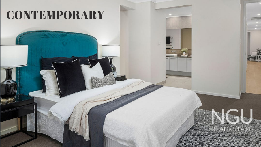
In the contemporary home – The mood-setting feature piece is the velvet, peacock blue bedhead. In the colour psychology, peacock blue is often described as tranquil and peaceful, which makes it a great colour to use in a bedroom. To avoid clash of too many bright colours, we’ve toned down the colour palette across the cushions and linen.
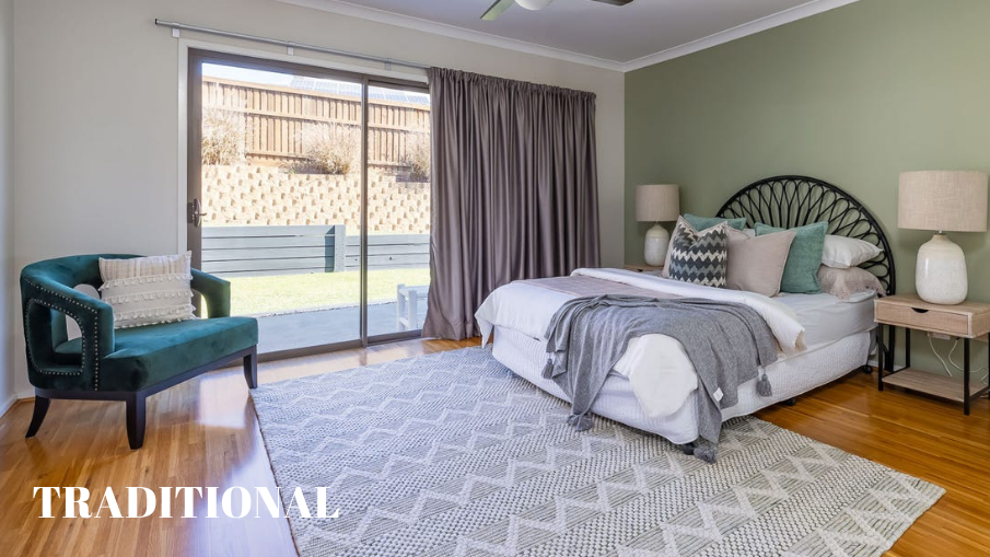
In the traditional home – The feature in this room was the dusty green-coloured wall. We’ve dressed the bed in matching colour scheme and added a velvet green armchair in the corner for an additional visual interest.


Facebook Comments