If you are about to put your house on the market, don’t underestimate the power of a beautifully styled kids’ bedroom. While the kitchen, living and master bed are all important areas to focus on, kids’ bedrooms have a special place in people’s hearts, exuding that warm & homely feel.
Home buyers with children pay extra attention to these rooms, knowing it could be their child’s everyday environment. They will spend much of their time there playing, studying, relaxing, and growing up – until they become teenagers and turn the room into a mysterious, who-knows-what-is-going-on-there cave. Whatever you do then, for crying out loud just ‘DON’T ENTER WITHOUT KNOCKING, MUM! Ugh!’.
Anyone else just hugged their toddler extra tight after reading this? Surely, they’re not going to be like that. Surely not…. right? *chuckles nervously*
But let’s talk about styling!
Kids’ Bedroom Staging Tips
What size of bed should you use?
We have some basic guidelines that all our Foxy Stylists follow.
Rooms bigger than 4.5 x 5m
- King Bed – unless there are pendant lights prohibiting us from fitting a king-sized bedhead
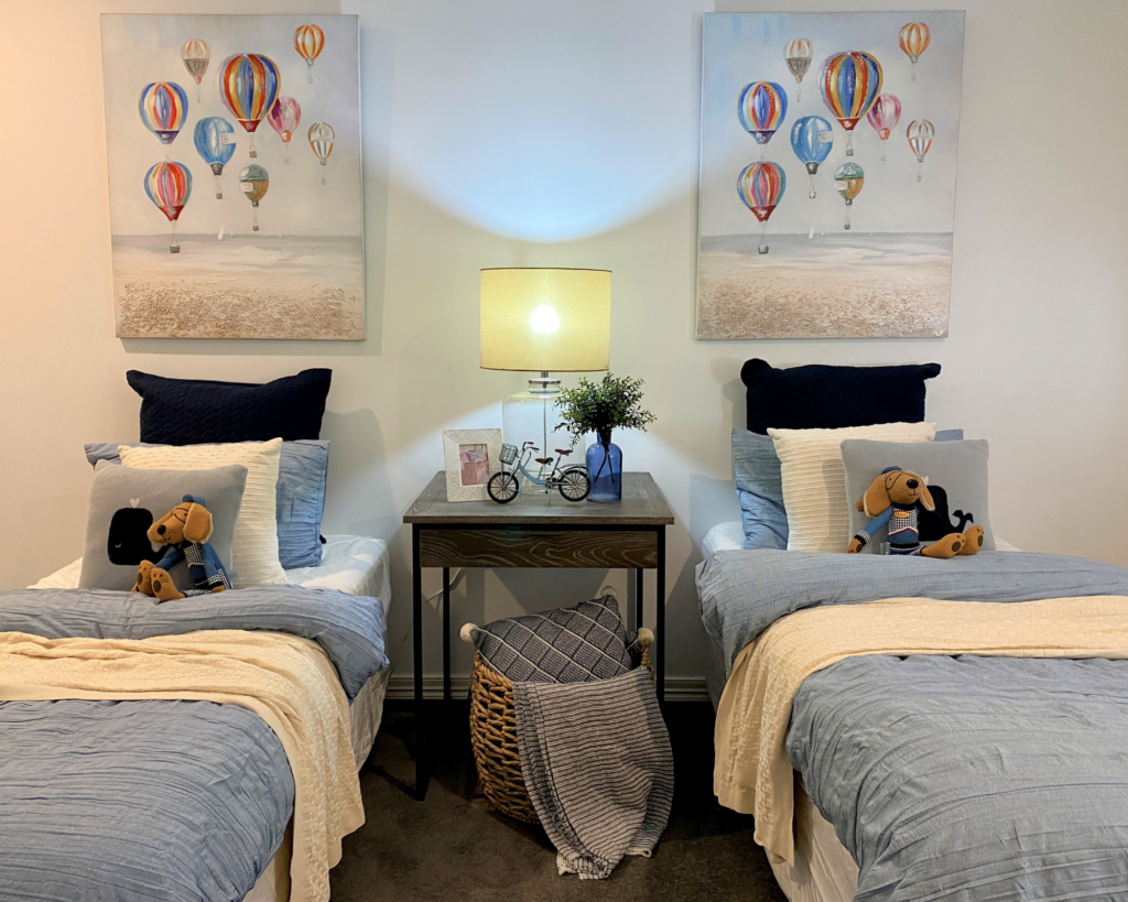
- Twin Single – provided it’s a family home with lots of bedrooms and at least 3 living spaces (otherwise it doesn’t make sense)
Standard rooms 3x3m
- Queen Bed – for master bedroom
- Double Bed – for any other bedrooms in the house (but never for master)
Rooms smaller than 2.7m
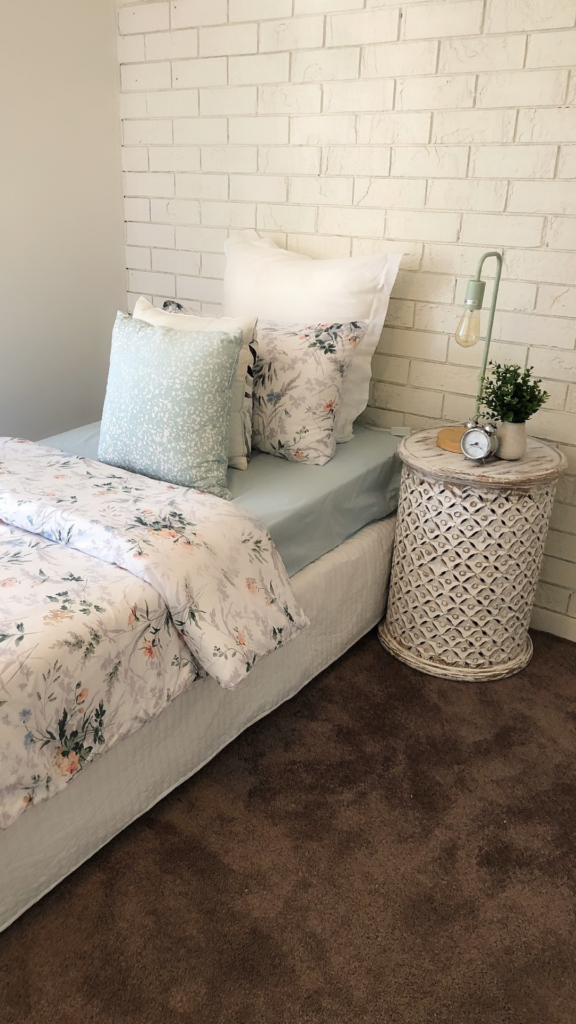
- Single Bed
- Home Office
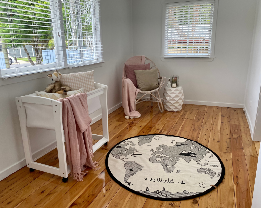
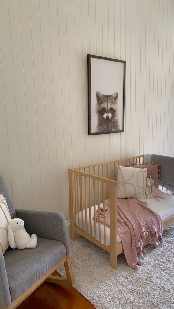
- Nursery – careful, they make the room appear smaller than it really is
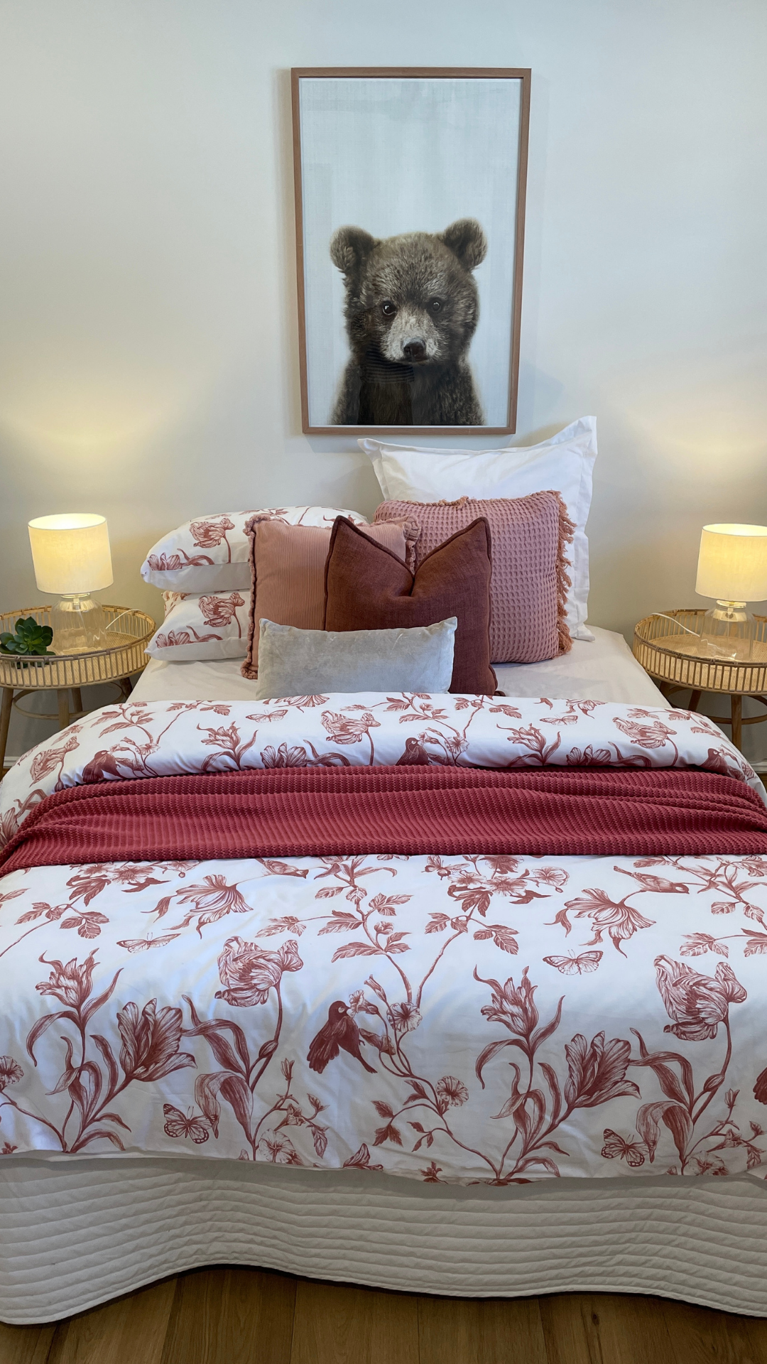
Make the Room Look Spacious
Getting rid of any ‘unnecessary’ furniture gives the room an instant boost in capacity. Some furniture items like dressers or tallboys indicate a lack of storage space, which is definitely not a thought you want on the minds of your potential buyers.
Decluttering also makes a massive difference to the overall appearance. Any toys, personal items, trophies, etc. could be considered messy. Our advice is to strip everything back to blank canvas – start with just the bed and bedside table and go from there.
Colour-Coordinate
We are all for creating a theme, but if you can – stay away from TV cartoon characters. As cute as they may be, their bright colours can come across a bit too gaudy, creating ‘too busy’ of a look.
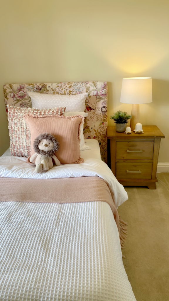
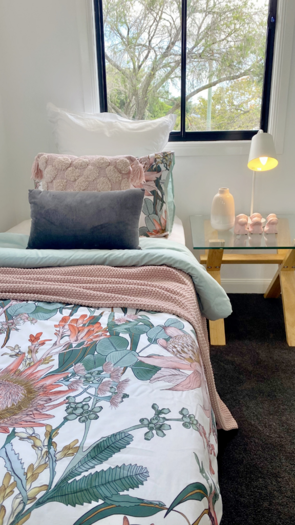
For linen, choose a white base and pair it up with pops of pastel- or subdued coloured cushions and matching artwork. Beware of bright colours or too much pattern, as they appear cheap.
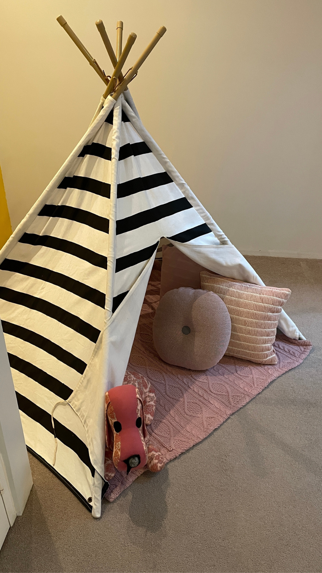
Fill the Empty Space
If the room is bigger than usual or is an odd shape, try not to leave the extra space empty. Too much of an empty space does not make the room look bigger, but it sure can interrupt the overall flow.
For kids’ bedrooms, we suggest turning these spaces into a study area or a reading a nook, or even a little playing area with a teepee!
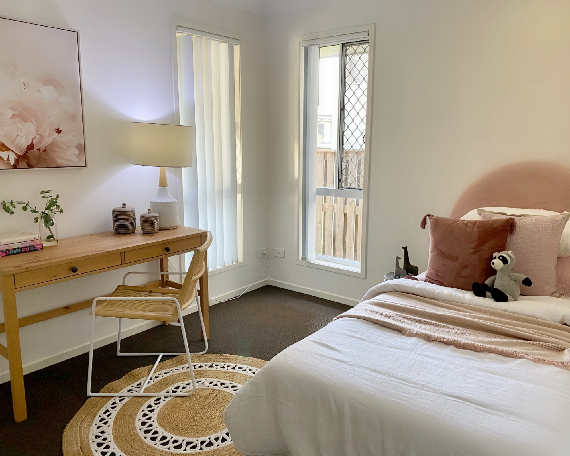
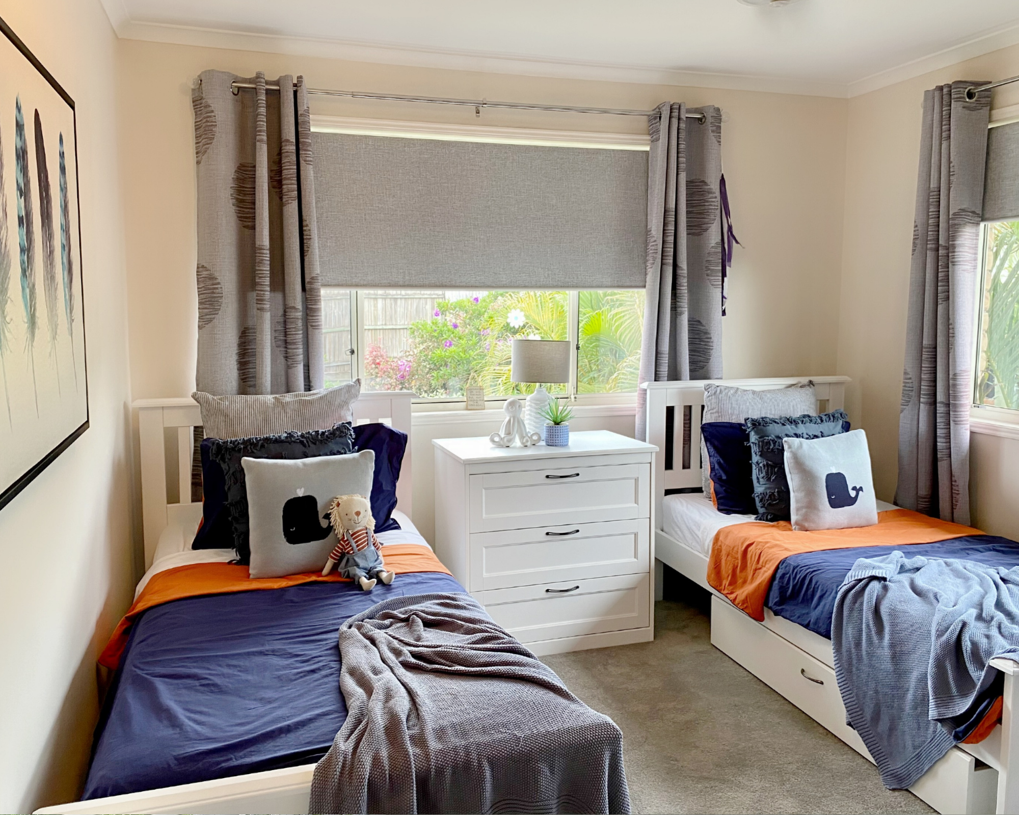
Girl, Boy or Gender-Neutral?
It depends. The perfect choice would be ‘gender-neutral-ish’, but that’s not always feasible. For example, if the walls are pink, purple or yellow – styling it in anything other than the ‘girly’ look would appear mismatched.
Certain colours like teal, mustard or green are received well by both genders, plus they also showcase the potential of being a guest bedroom.
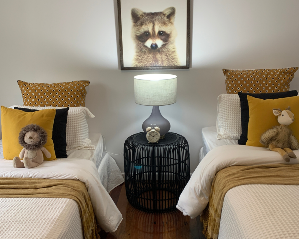
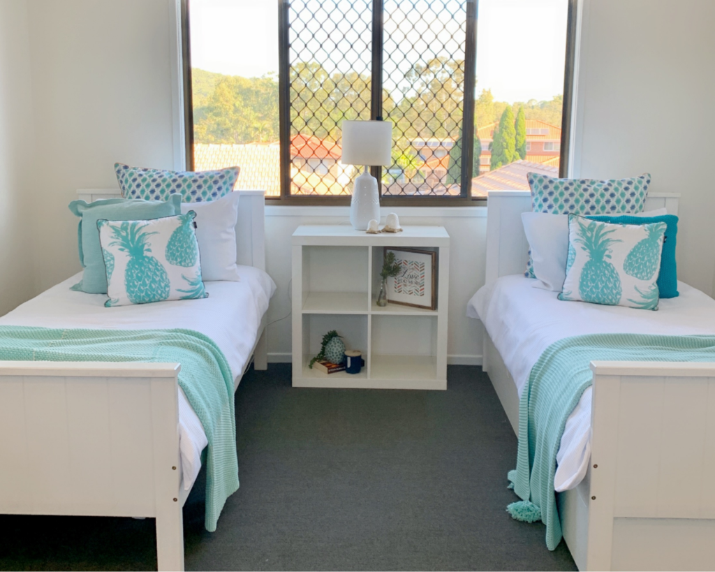
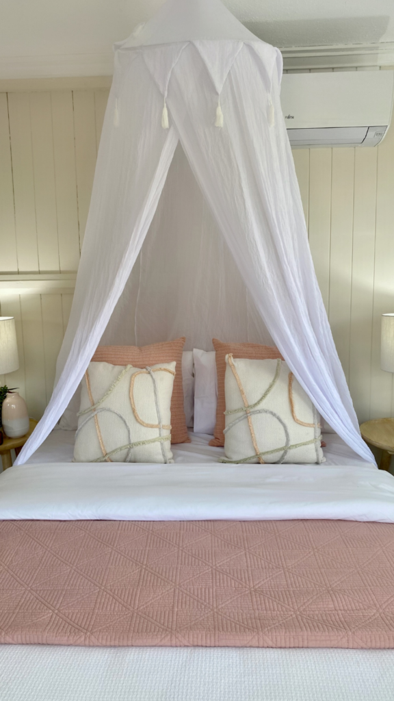
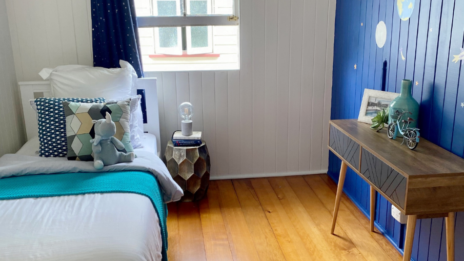
Get Inspired!



Facebook Comments