Decorating with Books & Magazines
I’ve been wanting to write about this topic for ages!
Ever since I started working here at Foxy, I’ve been secretly wondering how our Stylists choose their prop books for home staging. Is it based on the title? Or perhaps on the colour of the cover? Have they ever read any of them?
Well, today was the day I waltzed into their styling room, sat myself on the table, opened my notepad and confidently announced “Girls, tell me everything about books.”
Understandably, I was met with a lot of confused looks.
“What do you mean ‘books’? I haven’t read any lately, but I watched this really good TV Show on Netflix last night!”
“No, I meant books as in… what show was it?”
***30 minutes of wasted company time later***
“Okay, so… books! How do you choose which ones to style with?”
Good news, ladies & gents. I got the answers I was after… eventually. So, without any further ado, this is what our Property Stylists had to say about decorating homes with books & magazines.
—
3 Types of Books We Style With
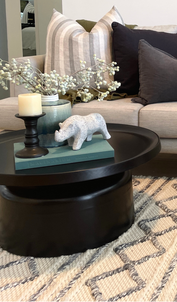
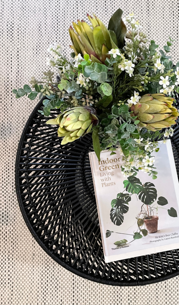
- Coffee Table Books – hard-cover, lifestyle books suitable for coffee tables, consult tables & buffets
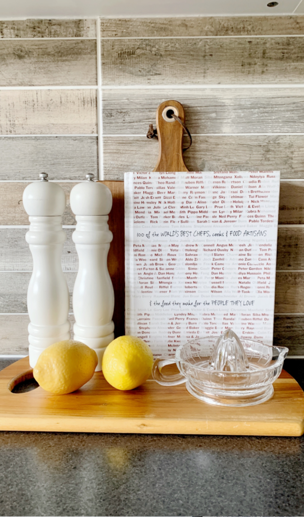
- Cookbooks – perfect for styling kitchens & dining tables
- Novels – for bedside tables, study desks & shelves
What about magazines?
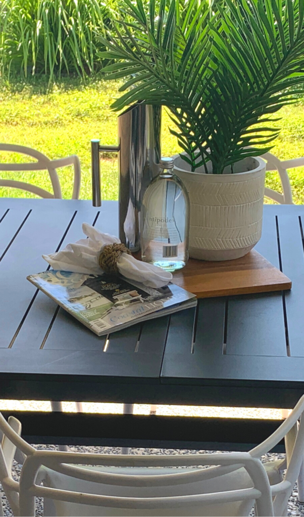
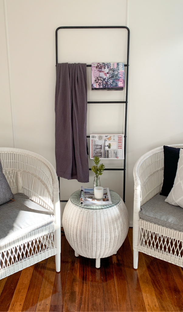
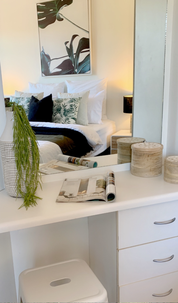
We see books as features and magazines as accents. You can place them virtually anywhere where you would usually place a book to create an additional point of interest. The most suitable areas for magazine placement are outdoor tables, dressing (or make-up) tables & clothes racks.
TIP: We use homeware & interior design related magazines only and avoid anything that is specific to a hobby or occupation (craft, business & finance, auto magazines, fashion & entertainment, etc.). The idea behind this is to appease to the largest possible number of buyers without segregating a specific group.
5 Tips for Choosing the Perfect Book to Style with
1. Match the Colour Scheme
Adhering to one specific style/colour palette is undoubtedly one of the most important rules of home styling. We keep the same style congruent across all living areas (lounge, dining, kitchen, etc.) and unleash our creativity on bedrooms, giving each one a different splash of colour & personality.
Books may seem like a small decorative detail, but details create the big picture. That’s why it’s important to choose a book cover that matches the overall colour palette of the room.
TIP: Sometimes it’s only the spine of the book that has the colour we’re looking for. In these cases, we place another book on top, concealing the non-matching front cover.
2. Pay Attention to the Title
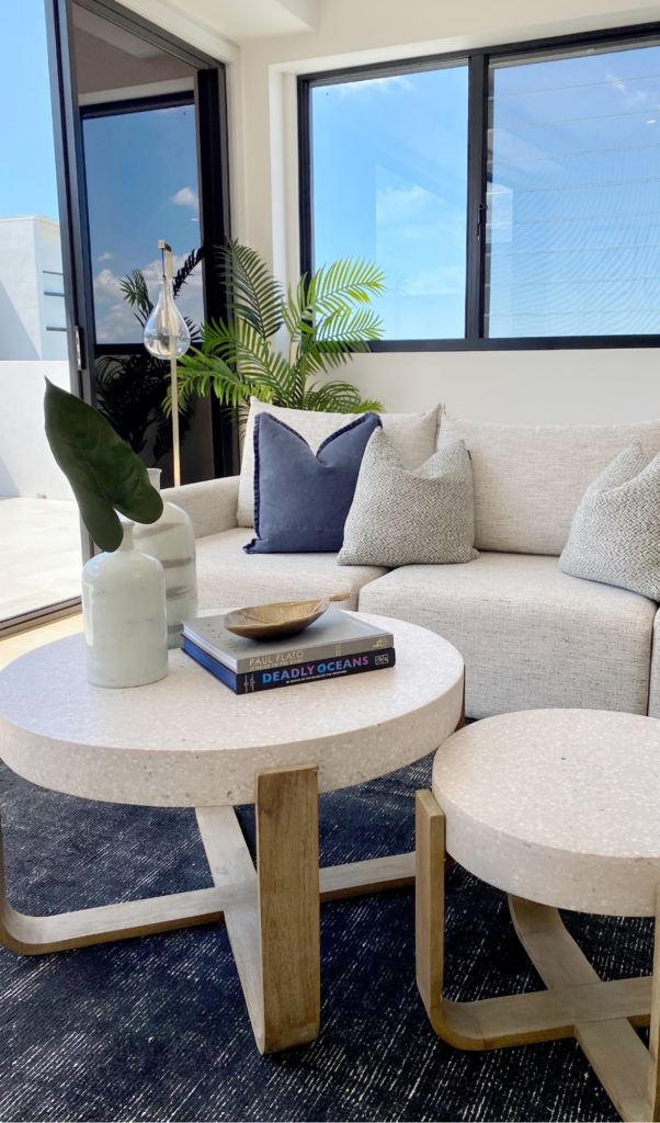
The title of the book may not be as important as the colour, but it’s still a significant aspect to consider. Our Stylists always try to match the type of book with the targeted market demographic. Is the potential buyer more likely to resonate with a classic novel or an educational reference book? What title is going to grab their attention? Does the genre match the room, theme & style? A few examples of matching pairs:
- pink kids bedroom + fantasy novels for girls
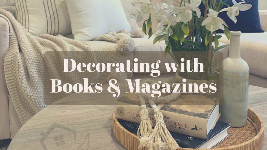
- coastal style + books about ocean (pictured)
- elegant office area + encyclopaedia
3. Rule of Three
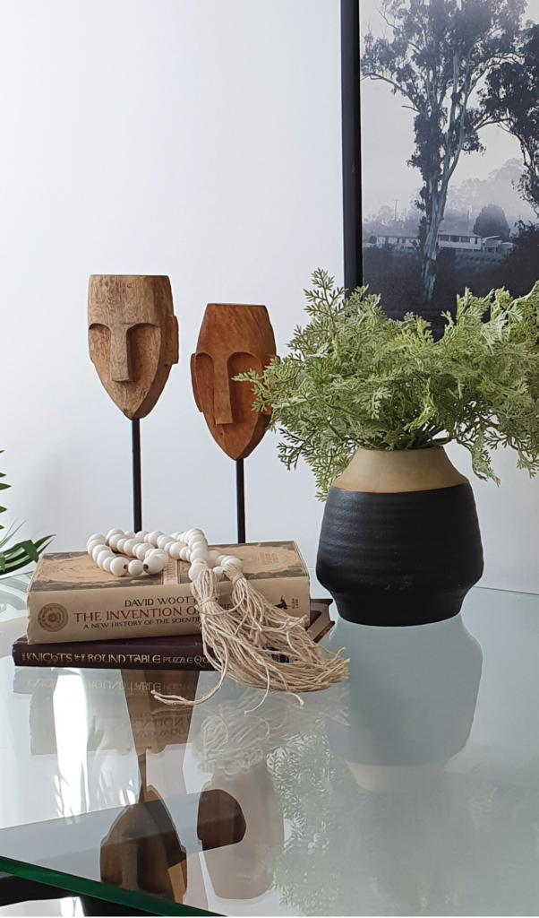
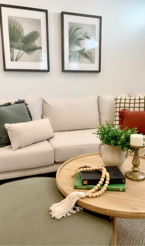
The ‘Rule of three’ is a principle commonly used in creative industries like writing, moviemaking, graphic design or even home decorating. It turns out three is the “magic number” when it comes to making anything more appealing and memorable. Apparently, our brains tend to naturally gravitate towards odd-numbered things and three is the smallest number that can be used to form a distinguishable pattern in our heads.
Three little pigs, Goldilocks and three bears, movie trilogies, ‘stop, look & listen’ – we could go on and on.
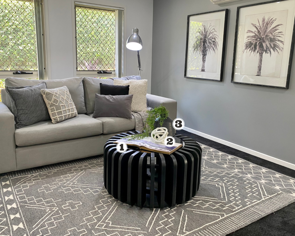
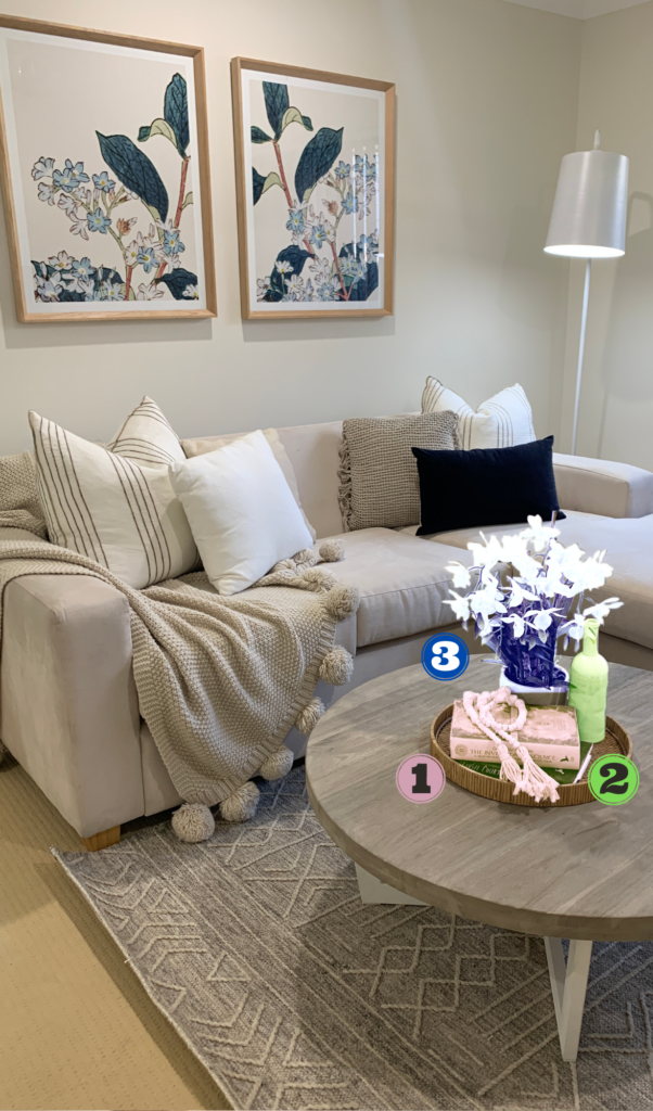
So how exactly do we use the Rule of Three in property styling? It’s simple. We display our decorations in groups of three. It’s important to highlight that this does not mean three individual objects, but three clusters of décor.
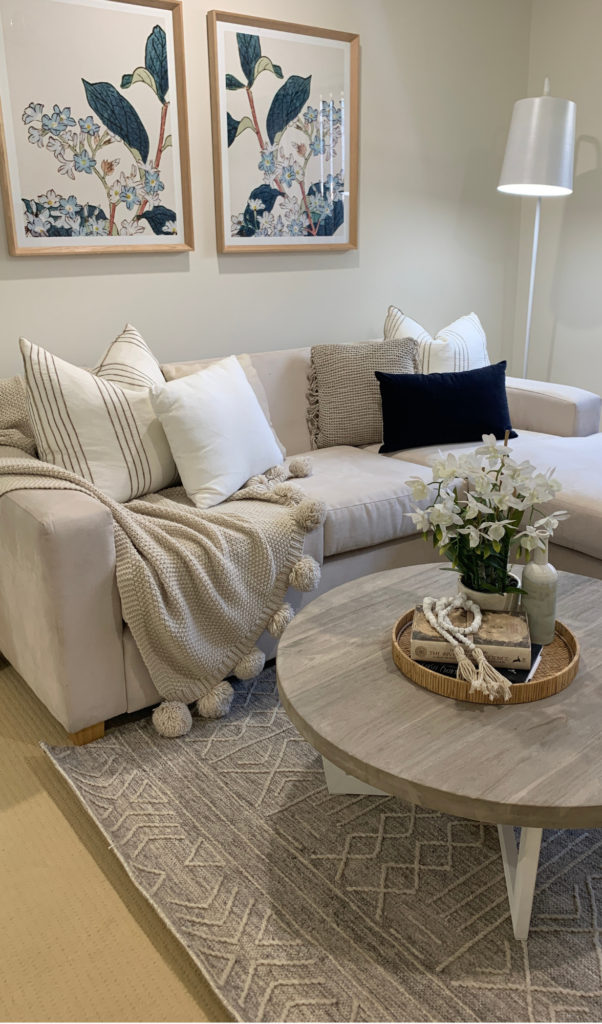
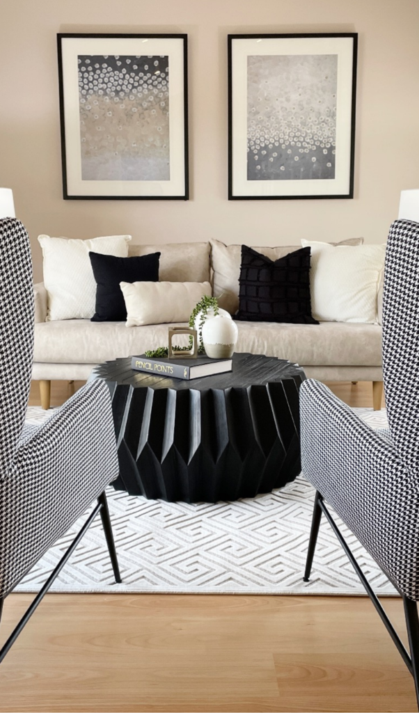
In this case, there are six individual items on the coffee table (tray included), but they have been visually divided into three groups of clusters. Cluster 1 is a stack of books + beads, cluster 2 is a vase and cluster 3 is a vase with flowers.
PS: Can you spot the Rule of Three styling principle on the sofa?
4. Texture of the Cover Influences the Price Point
Say what? It may seem far-fetched, but it’s true.
You don’t need to be an avid reader to recognise which books look cheap or expensive. For example, books covers made out of fabric materials appear more luxe, therefore contributing to the overall high-end look of the property. We’ve said it before, but it really does lie all in the details. Our subconscious mind picks up on them and shapes our perception, including the value we attribute to the house.
5. Don’t be Afraid to Open Up
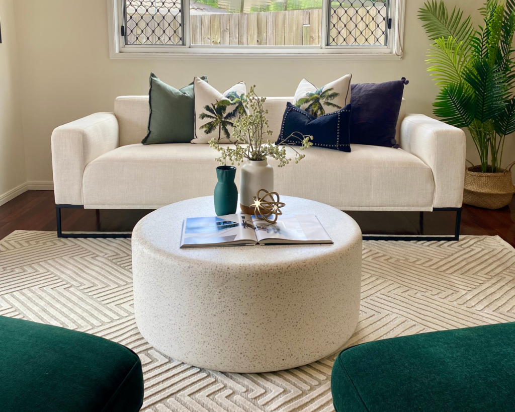
This is a little trick our Stylists use. If the colour of the cover or the title of the book don’t quite suit the style they were going for, they simply open the book up on a more complementing colour-matching page.
It’s also a great filler for large spaces that would otherwise appear too empty or bland. Apart from creating the ‘lived-in factor’, an open book also provides an additional element of interest for the curious buyers.
TIP: Choose a recipe from a cookbook and combine it with matching utensils for the ultimate kitchen shot!
Where Do We Source Our Books From?
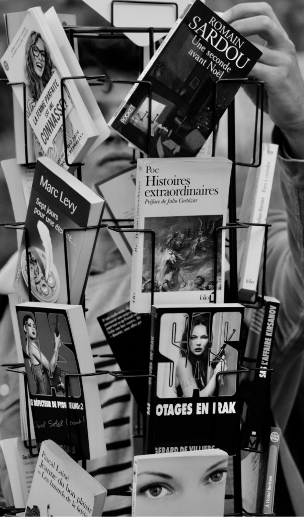
We wish we had a fancier answer for you than ‘shopping centre bookshop kiosks’, but it is what it is.
Do you know the $3 SALES they have every now and then? That’s where you can find us, most likely still in uniform, picking and choosing the most interesting colours, textured covers or famous chef biographies.
BONUS: Our Stylist’s Faves
Cassie
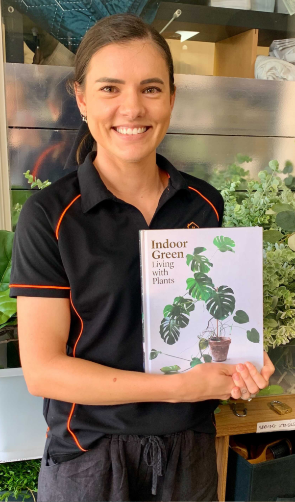
“I love this one, because I can use it in every house! It has a white background, so it doesn’t matter if the interior is beige or grey, the colours won’t clash. It also goes beautifully with the greenery we bring in. Oh, and green is my favourite colour!”
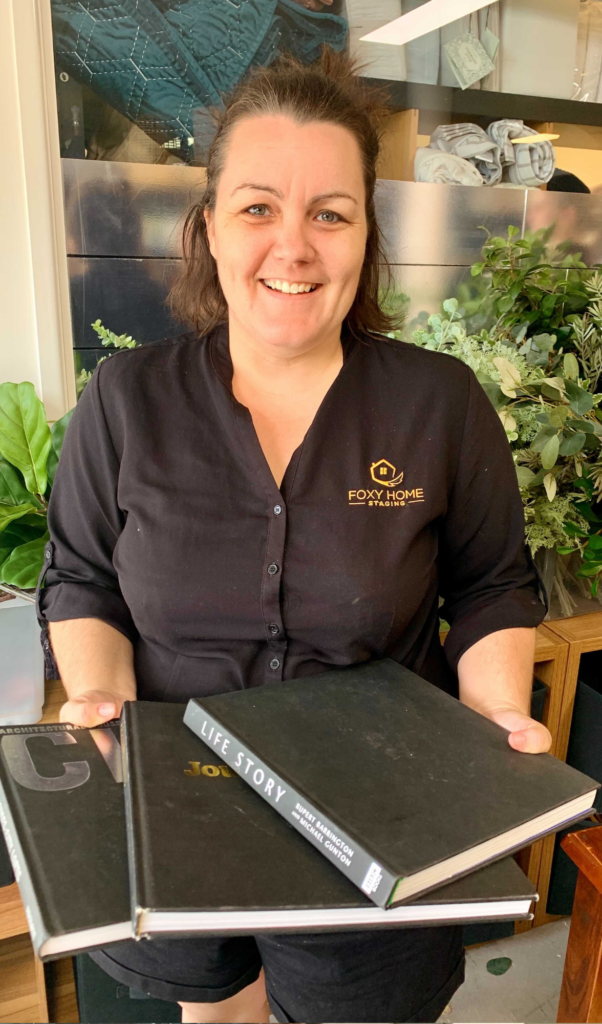
Phoebe
“I don’t have a favourite, but I love any of our fabric-covered books for adding that extra element of texture. It just makes any room look so much more luxe!”
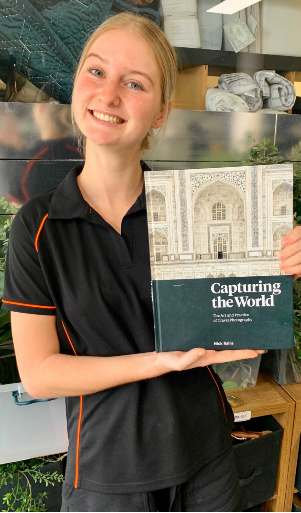
Caitlin
“Well, my actual favourite is Hamish & Andy’s Coffee Table Book, but we don’t have it here at the moment. Otherwise, anything travel-related because I love travelling! This one’s got a beautiful cover, so I always display it closed and paired up with some nice accessories.”
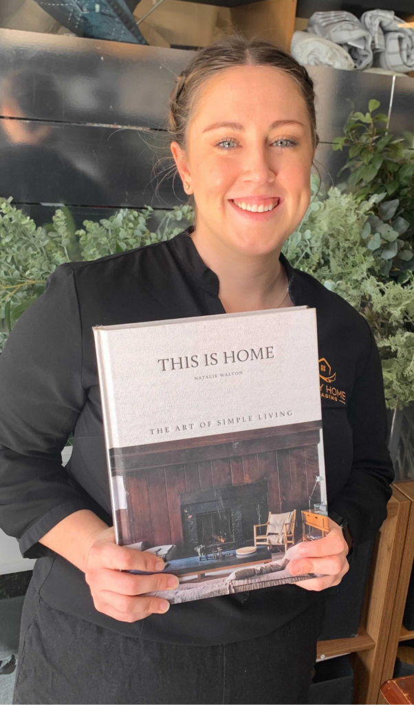
Jenessa:
“I have two go-to books that I love styling with. The first one is called ‘This is home’ and I love that every page has a different colour scheme and style – it means I can use it in every house! The second one is called ‘The Resident Dog’ and it’s one of the coolest books I’ve ever seen. “
Thanks for reading!
Follow us for more property styling tips & tricks on Instagram, Facebook or watch our Youtube Channel. See you on our socials!


Facebook Comments