5 Tips for Styling a Duplex
What is a duplex?
A duplex is a building containing two homes that share a common central wall. These homes are two entirely separate entities with their own entrances.
—
In our experience, duplexes tend to attract attention of various buyers with diverse backgrounds.
Investors want to take advantage of the double rental income generated from one asset, first-home buyers like them for the attractive price (which is much lower than the price of a detached house) and families appreciate the opportunity to create a separate living space for other family members, who may need extra care or limited supervision, while still maintaining decent privacy.
Why are duplexes challenging to stage?
Taking into account the diversity of the target market, the first challenge lies in choosing a style versatile enough to capture interest of all the different groups and demographics walking through the property.
For example, selecting a trendy/contemporary style with the intent to appeal to first-home buyers might be a potential deterrent for families looking for a retirement place for their elderly parents.
Another important factor to consider is giving each house a unique look, so that when the buyers get home, they can remember both properties as individual, stand-alone dwellings.
Our Foxy Tradition
Before I tell you what the tradition is, there is one thing you need to know about us… we are all extremely competitive. Therefore, in the rare event we get to stage side-by-side houses, it’s on, baby!
Competition time!
I’m talking game face, smack talk, playful banter… the full package. It’s always a lot of fun, which may be the reason why our last competition video is one of the most watched FoxyTV episodes up to date.
Recently, we have been contacted to stage a beautiful duplex in Kelvin Grove. Watch our newest FoxyTV episode to see how it went.
Don’t forget to leave a comment with your vote – the winner gets a coffee, and the loser is bound to steam beds. (Can you tell how much we love steaming bed linen?) 🙂
1. Make Each House Unique
We have touched on this point a little bit already, but we cannot stress the importance enough.
Important to mention: Some duplexes are on subdivided land, which means the homes can be bought individually or together. Whichever the case may be, you should always strive to highlight that these are two separate dwellings that are being sold.
Doing this will increase the perceived value, as people are more likely to recognise that it is not one large house they are purchasing, but two separate entities.
It will also create a more memorable experience for the buyers walking through on the open day. They should be able to distinctively recall each house, based on their different styling elements.
2. Complement the Styling to the Build
This is a universal styling rule, but one worth highlighting specifically when it comes to staging a duplex. Of course, you should always observe the home’s architecture –the fixtures & fittings and match the style accordingly.
Due to numerous categories of duplex buyers, altering the chosen style based on the targeted demographics becomes difficult.
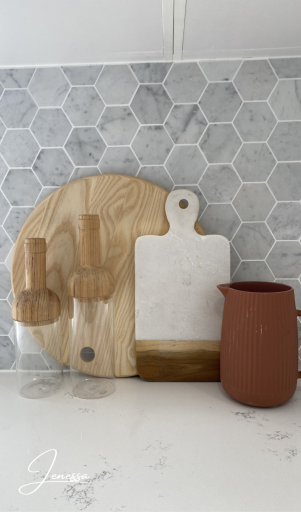
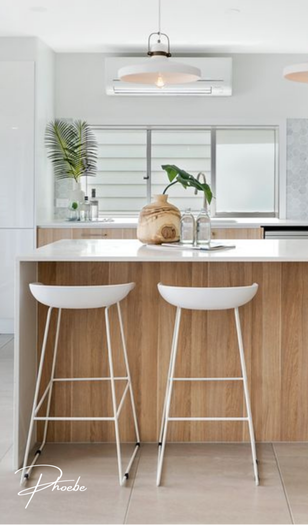
At Foxy, we select the main style based on the type of house and we give it a little spin. For example, in our most recently staged duplex, both homes had coastal features.
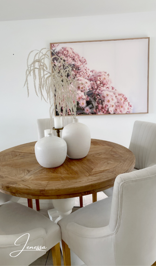
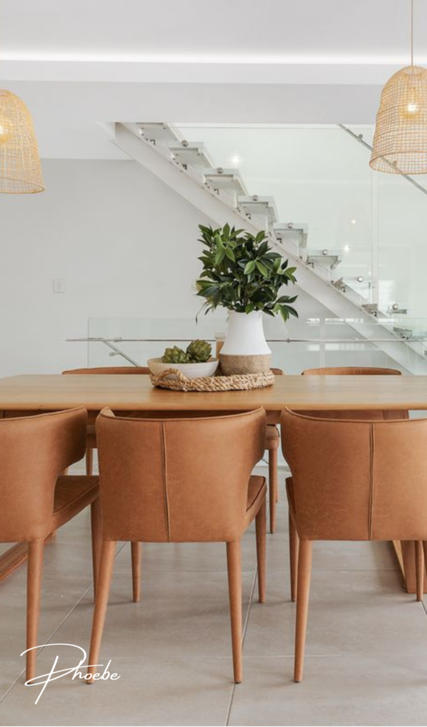
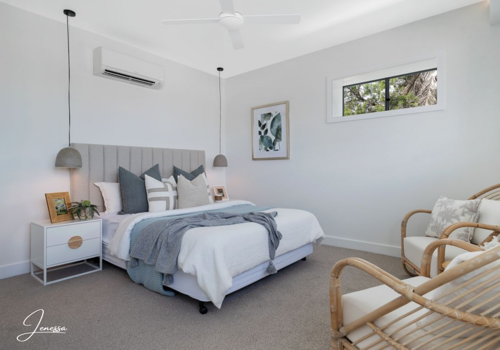
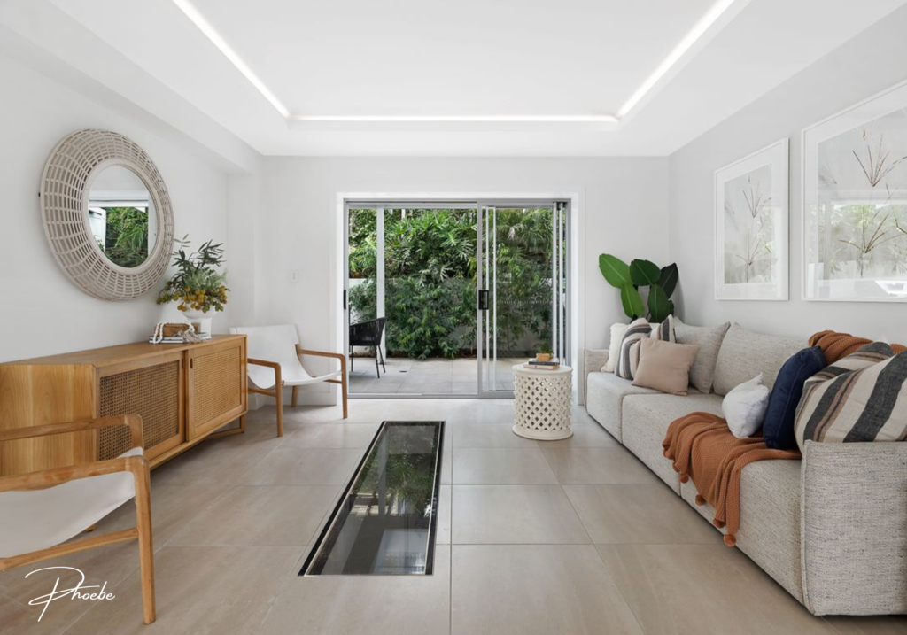
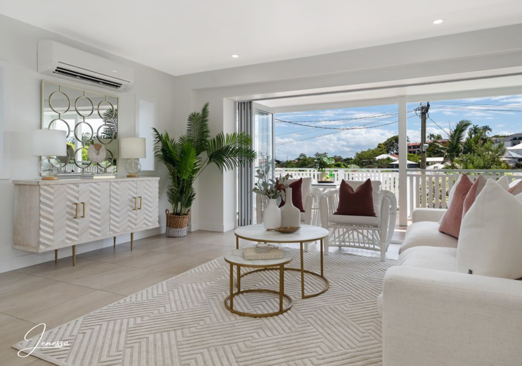
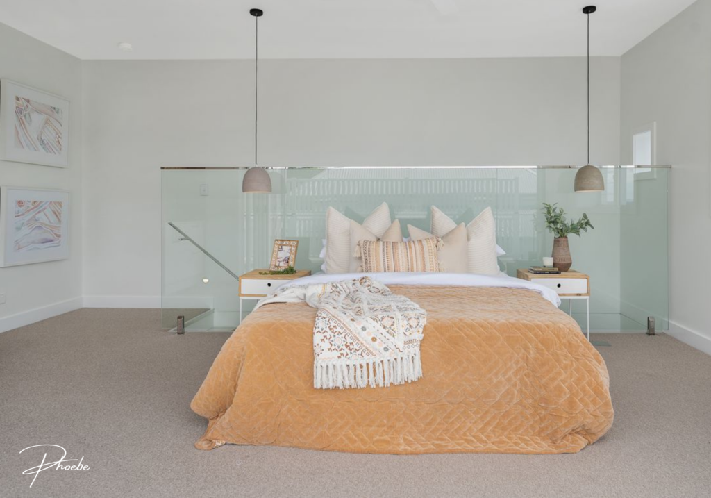
Jenessa decided to go with the luxe coastal style and Phoebe chose the relaxed coastal for hers.
Both of our Stylists adapted to the architecture of the house, while keeping each property different and beautifully unique.
3. Stick to Neutral Tones
Neutral, earthy tones (white, grey, beige, cream, etc.) with only some pops of colour is the golden rule of staging.
It’s a ‘safe’ approach, guaranteed to be liked by everyone.
4. Choose the Right Sized Furniture
Duplexes are known for having odd-sized or unusually shaped rooms. That is why we take extra care to review the floor plan thoroughly, or even better – visit the property in person before we style.
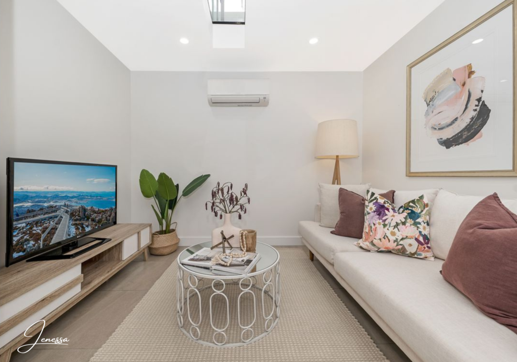
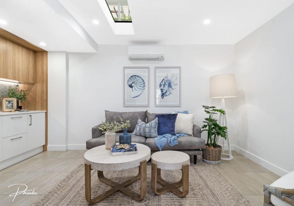
In our most recent duplex, there was a small living space downstairs with a ceiling window. Both of our Stylists decided to convert this space into an entertainment area, while keeping the upstairs living room as more of a conversational space.
—
This was a small room that was made visually larger by bringing in smaller sized furniture. Well executed by both of our ladies!
5. Add a Splash of Personality
This is the part our Stylists love the most. Each property deserves a featuring piece, something that will stand out and help people remember it by.
—
Jenessa chose to add pops of pink into her living space and dining area, which is a colour that always photographs beautifully.
Phoebe created an adorable master bedroom with earthy tones and hints of Moroccan design, which is the current trend hitting the market, advertised by most retailers.
Thanks for reading!
—
Don’t forget to share your vote! You can simply add a comment with your favourite house to any of these posts across our social media:
- Facebook – click here
- Instagram – click here
- Youtube – click here

Facebook Comments