 What is Foxy at Home? Let us take you behind the scenes of styling homes for sale. At the end of the article we share the names of our furniture suppliers and retail shops, keeping absolutely no secrets when it comes to helping you fall in love with your home again!
Recreate The Look
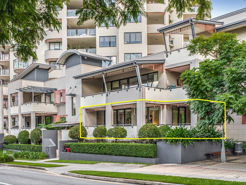
7/9 Sylvan Road, Toowong
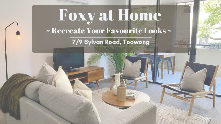
Perfectly located just 5km from Brisbane City and across the street from the well known Regatta Hotel, this modern unit came up a treat when we had finished staging it ready for sale. Featuring two bedrooms, two spacious balconies, an open plan living space, and a well-equipped kitchen, this Toowong apartment was the perfect candidate for a couple or small family chasing the city lifestyle. With a stunning view of the Brisbane River and some fantastic facilities within the apartment complex, it’s no wonder this unit sold so quickly and for such a great price! Keep reading to see how our styling helped to elevate the apartment’s potential – resulting in a fantastic outcome for the seller. At the end of the article we also share where we purchased the furniture featured throughout, so if you see something you love you can replicate the look in your home.
Story Behind the Sale
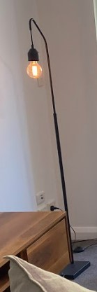
This property was vacant when we staged it for sale, and we were tasked with styling everything from the bathrooms to balcony and all the rooms in between. The lead stylist for this job had an extensive amount of creative freedom when it came to furniture selections, colour choices and the accessory options due to the apartment’s neutral coloured walls and flooring. As you’ll see in the photos, wooden furnishings with pops of black was a recurring theme throughout the entire unit. This not only created a cohesive and visually pleasing home, but the modern elements helped to draw in a young to middle aged audience, which was essential for a successful sale given the apartment’s location and size.
Result of the sale: SOLD for $500,000 less than two months after being listed – a fantastic outcome!
Fun fact: The new owners of the unit recently chose to sell after having lived there for a little over a year. They loved our staging so much when they bought the apartment in June last year that they asked us to stage it for their sale last month, only this time we incorporated integrated staging, meaning we used most of their existing furniture pieces and rearranged the space before adding accessories and décor. This time around it has been on the market for just one month and is already under offer. It’s such a great outcome! If you’re wanting to see the staging for this year’s sale, you can check it out here
Living, Dining and Kitchen Areas
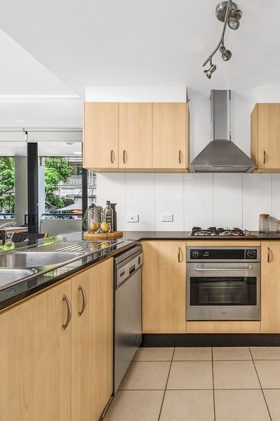
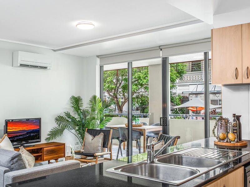
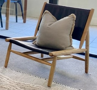
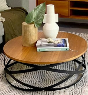
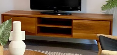
Aside from modernising the home, bringing in wooden and black furniture pieces was also done to complement the existing features in the kitchen, namely the wooden cabinetry and a black countertop.
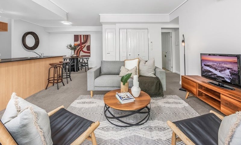
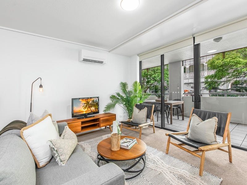
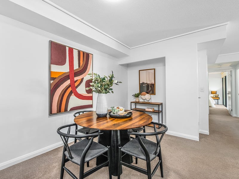
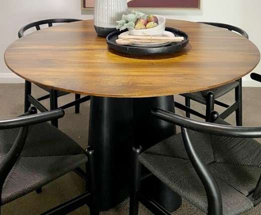
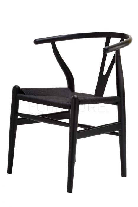
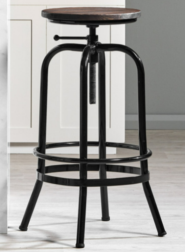
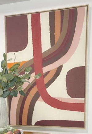
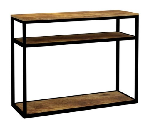
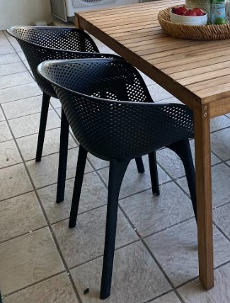
You’ll see that the wooden and black coffee table and occasional chairs in the living room, along with the barstools, console table, and dining table and chairs create a seamless flow from the kitchen to the dining and living rooms. This aims to guide the eyes of possible buyers and draw attention to the home’s best features, helping buyers to envision themselves living in the space. To accompany the furnishings, we also added pops of colour in the form of couch cushions, greenery, the beautiful big artwork in the dining room, and the spreads on the dining table, coffee table and kitchen counter.
Bedrooms
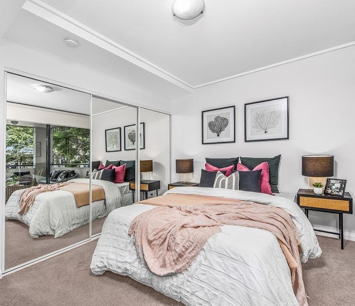
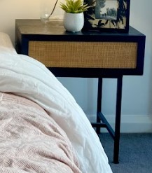
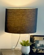
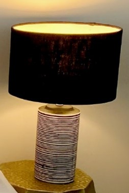
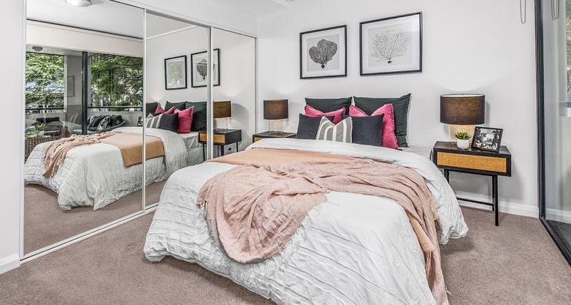
We had one master bedroom and one secondary bedroom to stage in this unit, which our team styled differently to appeal to a larger audience. Looking at the master bedroom, you’ll see we carried through the black and wooden theme with our choice of bedside tables before adding in a pop of pink to brighten the space, as well as add interest and intrigue. Using a white quilt lightens up the room, while the inclusion of dark grey cushions adds depth.
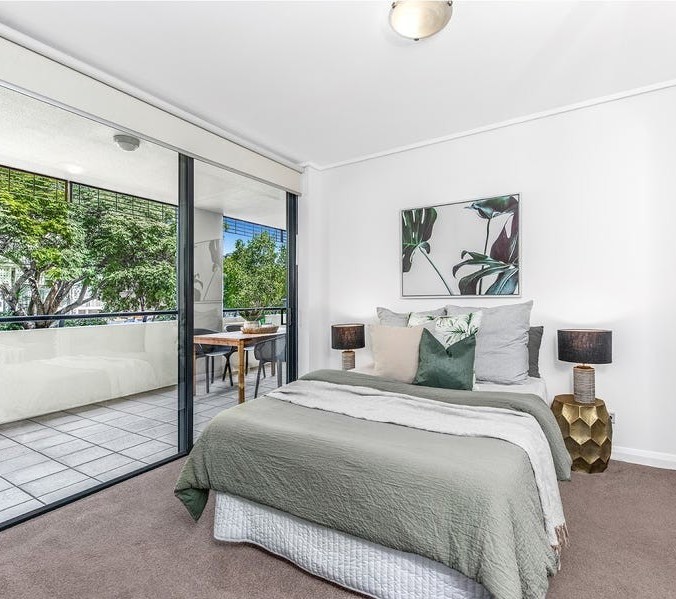
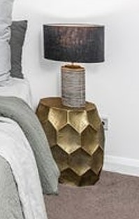
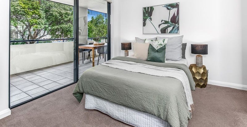
In the second bedroom, a green theme is very evident. The colour green is associated with nature, giving it a fresh, clean and homely feel. Given the apartment complex is surrounded by trees and other forms of greenery, this colour works extremely well in the space. The use of a white valance aims to lighten up the room and create a distinction between the carpet and the bed spread.
Outdoor Areas
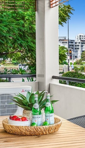
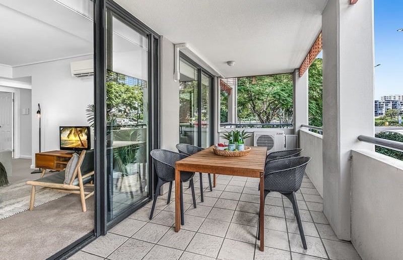
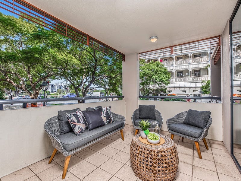
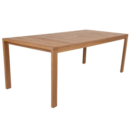
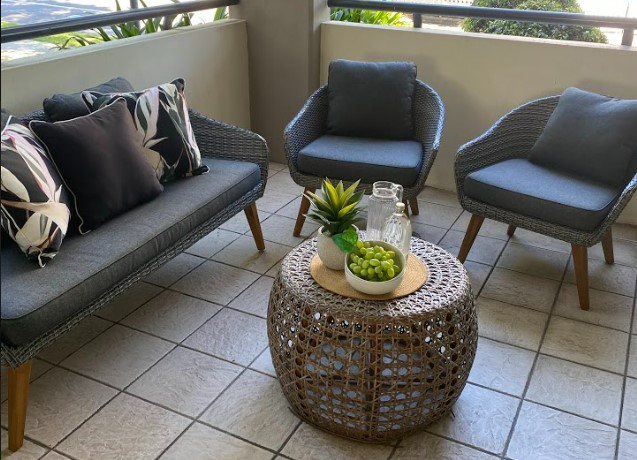
This Toowong apartment featured two spacious balconies overlooking the Brisbane River – making for a couple of gorgeous outdoor spaces. Because of this, it was necessary to style the balconies in a way that made them look inviting and showed potential buyers that the areas not only made for a great entertaining experience, but they were also spaces they could enjoy everyday. As such, we opted for an outdoor dining setting on one balcony and included a lounge area on the other for a more relaxed zone. This not only shows the sheer size of both of the areas (one balcony alone is 7.2m in length!), but also aims to exemplify the versatility of the spaces.
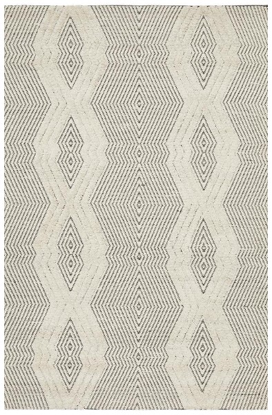
Where To Buy?
Sofa
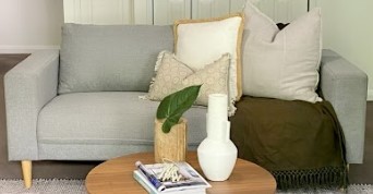
Vast Interior (not online)
Cushions and Throw are from Eadie Lifestyle, Adairs, and Pillow Talk
Thanks for reading! If you have any questions feel free to reach out to us on Facebook or Instagram – we always love to hear from you! Also, don’t forget to check out our Foxy TV episodes.




Facebook Comments