Welcome to Foxy at Home where I’ll take you behind the scenes on a property that we’ve recently styled. We’ll guide you through our process of choosing the style and at the end of the article we link to the furniture we used, so you can recreate your favourite looks!
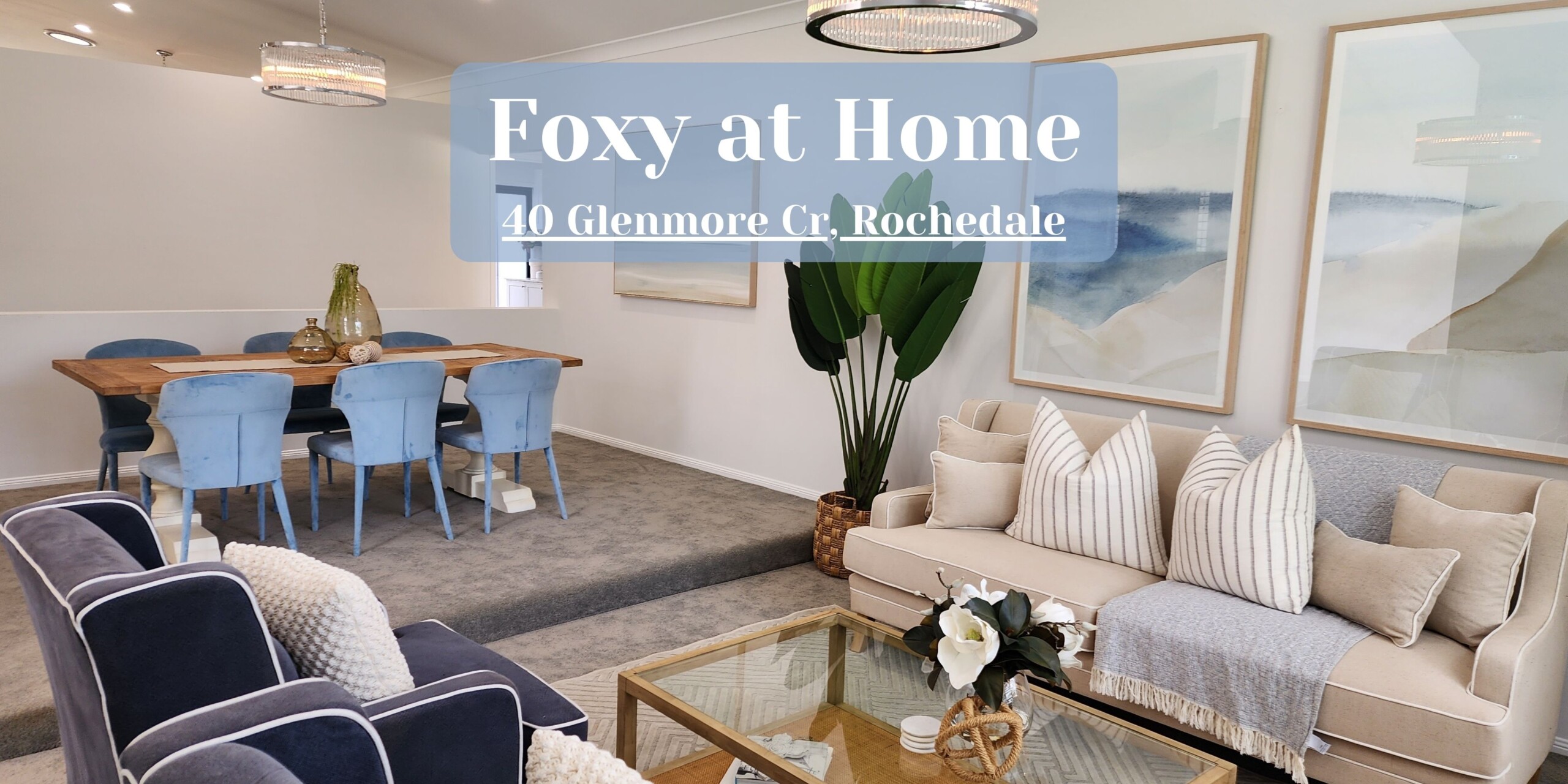
40 Glenmore Cr, Rochedale
Let’s travel together to the suburb of Rochedale. This area is rising in popularity because of its opportune location. Sitting on the outskirts of the city, Rochedale has stunning views of the scenic rim and is a tranquil, family neighbourhood.
Story Behind the Sale
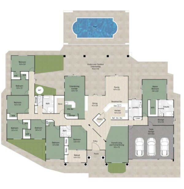
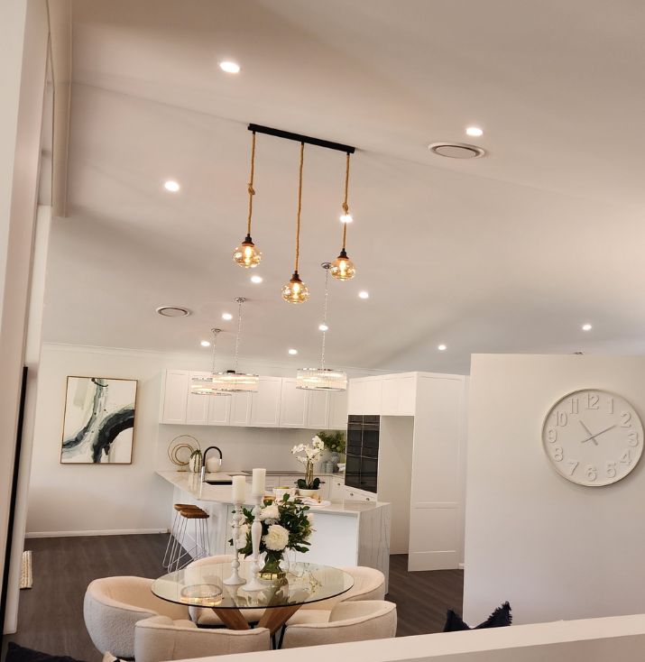
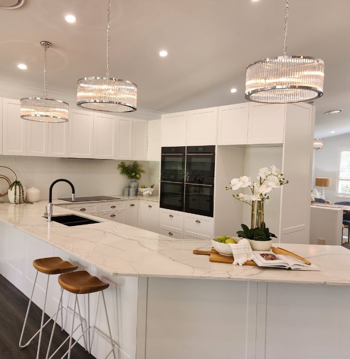
The property at 40 Glenmore Crescent is a big (and I mean big!!) family home. The home is nestled on expansive acreage, boasting 8 bedrooms, 3 baths and a pool. The property had been on the market twice previously, using virtual staging. And after no bites, the owners decided to employ our services. The style of the virtual staging was very modern and contemporary. As we staged it as a vacant property, we allowed the bare bones of the house to guide us in a stylistic direction. The home has white Hamptons style shutters, high cathedral ceilings and is very light and bright. To Phoebe, who was lead stylist at the install, these furnishings didn’t scream modern or Hamptons, rather contemporary coastal style. If you want to learn more about the difference between virtual styling and home staging, read this blog. To get a clear view of what we were working with check out the floor plan.
Or view the property listing here.
Story Behind the Styling
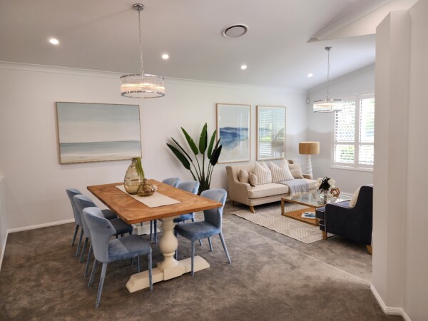
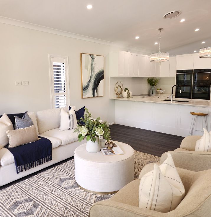
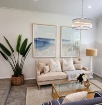
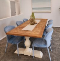
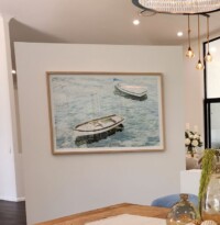
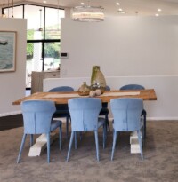
As previously mentioned, the house was very light and bright, which led us to style it as such. Phoebe opted for a contemporary coastal style and our colour choices were bright and white. But it wasn’t full blown Hamptons or coastal (which means we didn’t add any wicker), rather, we chose high end finishes and brand new artwork to emphasise the contemporary elements of the house. Because the home is so big, we had 3 living spaces; a formal living and dining room, a meal space right near the kitchen, and a media family space.
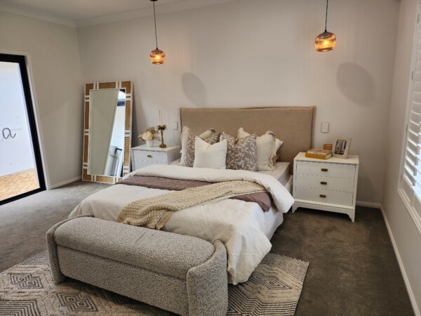
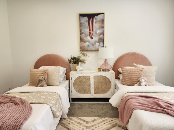
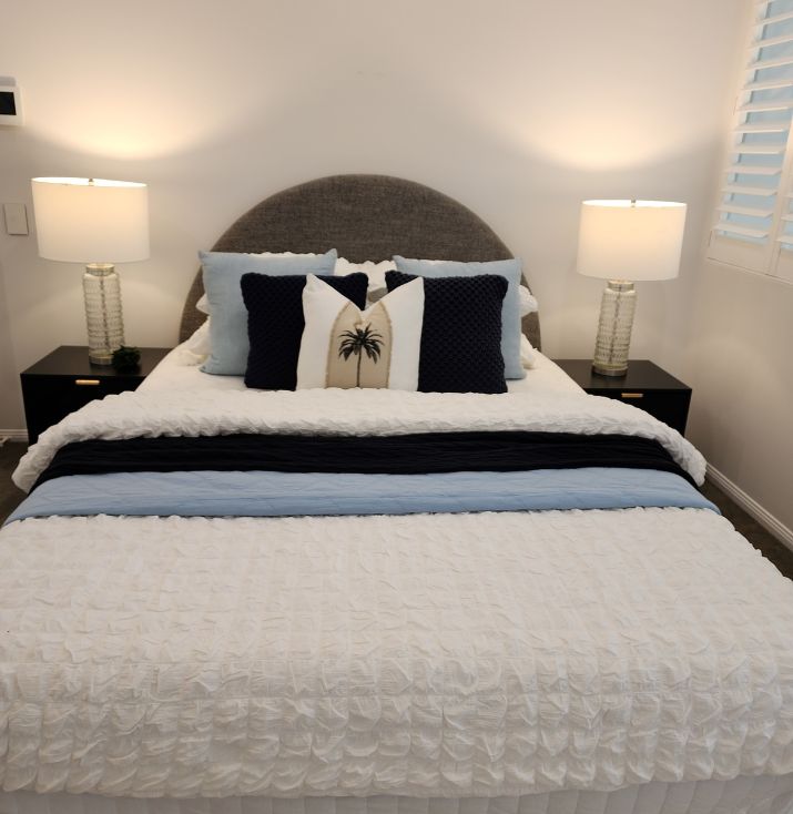
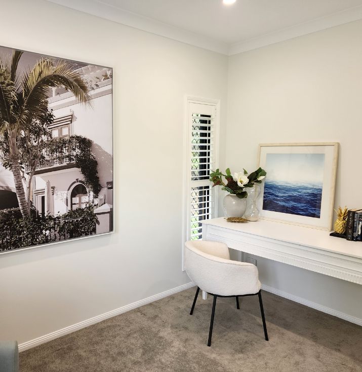
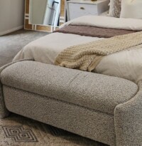
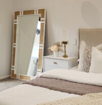
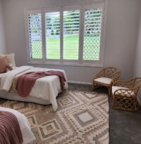
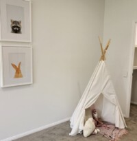
The property was originally marketed as an 8 bedroom house, and the virtual styling initially had the first room styled as an office. An 8 bedroom house won’t typically appeal to a broad audience, (how many families need 8 bedrooms?), so due to the potential of diminishing returns, we decided to style the first room as a guest retreat. The room was attached to a plumbed and tiled vanity area, so we were able to make this a peaceful guest oasis. After our staging, the house was marketed as a 6 bedroom home with a study and a guest suite. Which typically will appeal to a broader market. And because the rooms were very long and big, we added a twin single in one to appeal to our target market which was families, and to showcase the abundance of space. Floor mirrors are very in at the moment, so we opted for a luxe gold trimmed mirror in the master bedroom. As that bedroom wasn’t as big as the others, this helped to give an illusion of added space. Watch this reel to see how the property looks after our staging!
Recreate the Look: Where to Shop
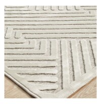
We’ve picked 3 of our favourite rooms to showcase the styling of this property. And as promised, we’ve linked to where you can find the furniture and décor.
Formal Living and Dining
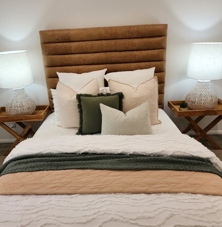
Master Bedroom
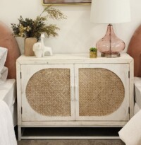
Bedside Tables and Candle Holders
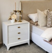
Iluka Road (not available online) and candle holders are from Madras Link
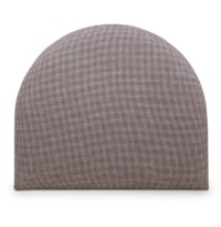
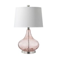
Twin Single Bedroom






Facebook Comments