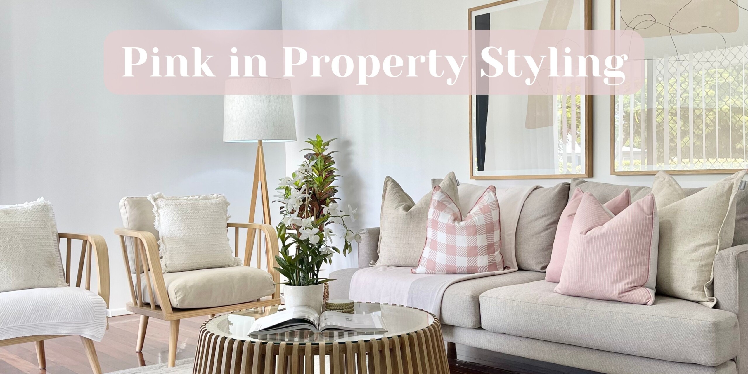
Pink in Property Styling
Have you ever noticed that when you go on Real Estate.com, it’s like entering a realm of cream, beige, gold, and white overload? We sure did! And after a few conversations with our agents (a few years ago now), we decided to change that and embrace a more colourful palette in general. Now, there is no need to be concerned by colourful; we mean muted and understated colour, not bold and overwhelming tones. So let’s talk pink in property styling!
In our opinion, incorporating pink into property styling comes with an unfair bias. People seem to believe that if we integrate pink in property styling, we’ll polarise masculine buyers. Well, we’re here to challenge that! Because pink isn’t just for the girls. We’ve got some examples of homes that pair perfectly with pink to show how appealing it can be to a broader market. Let’s dive into the wonderful world of pink in home staging, shall we?
Pink Trends
Pink has been a long-standing trend. We’ve witnessed the grip pastel colours had on the world, the allure of blush tones, and the undeniable elegance of blush velvet. The combination of pinks and golds has captivated us for ages, exuding a sense of luxury and sophistication. And now, we’re seeing the addition of pink and rattans to the mix. It seems like every mainstream retail store has embraced pink, and is marketing it to all people and age groups. So, pink is very versatile for styling because it can cater to the preferences of any buyer.
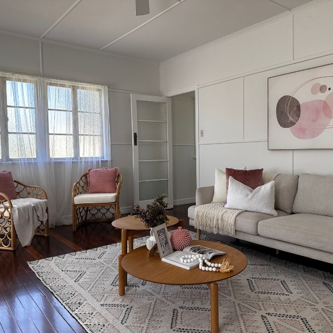
Pink in Cottages
Pink is a perfect choice when it comes to styling cottages, which are quite common in Queensland and Victoria. These pink tones work wonders in this particular type of home, especially those with frosted or stained glass windows that exude a pink light. The combination adds a touch of enchantment to these charming properties. To further enhance the aesthetic, we love pairing pink with lime green, to complement the green often found in stained glass windows. We also find pairing pink hues with complementary shades like olive green or lighter pink and blush tones creates a truly captivating staged home. When styling these types of properties, incorporating native plants like bottlebrushes, eucalyptus, and potias complement the pink tones and highlight the softness of the property. The artwork follows suit, featuring native plants to create a cohesive design. To maintain the cottage’s timeless appeal, we often opt for less contemporary pieces in the overall styling.
")

Pink in Older Homes
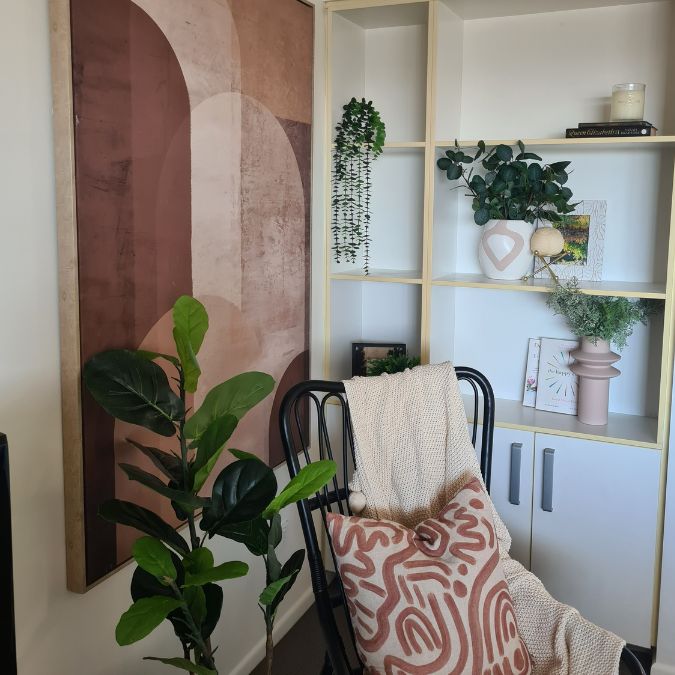
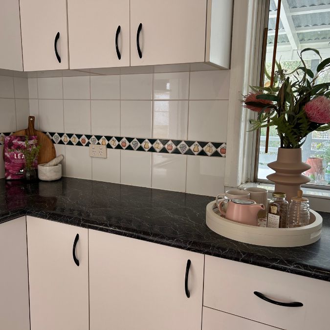
When it comes to homes with terracotta flooring, particularly the pinky white-toned variety, pink accents can work wonders. Terracotta flooring with a pink/white tone indicates a distinct era and provides the perfect opportunity to embrace pink tones. Incorporating pink hues can breathe new life into such spaces, modernising them while still complementing the existing colour palette. When working with these properties, our goal is to enhance their value without resorting to a full cosmetic renovation. Because a full renovation may not yield a dollar-for-dollar conversion. Instead, we aim for a more contemporary feel. Abstract art is introduced to add a touch of modernity, while incorporating stronger rust colour tones to create depth and richness. By embracing these robust colours, we successfully modernise what could otherwise be perceived as a dated colour palette, ensuring maximum value for the homeowners’ investment.
What we Avoid When Styling with Pink
When it comes to colour combinations, one pairing we tend to avoid is pink and black. These two colours create a high contrast effect that doesn’t always style up as seamlessly as other combinations. The softness of pink against the harsh black can result in a jarring visual contrast. Moreover, in relation to real estate photography, this pairing may not capture as well as we would like. As a result, we use pink and black sparingly, opting for other colour combinations that create a more visually appealing aesthetic.
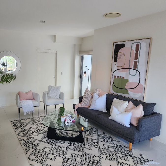
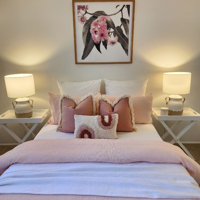
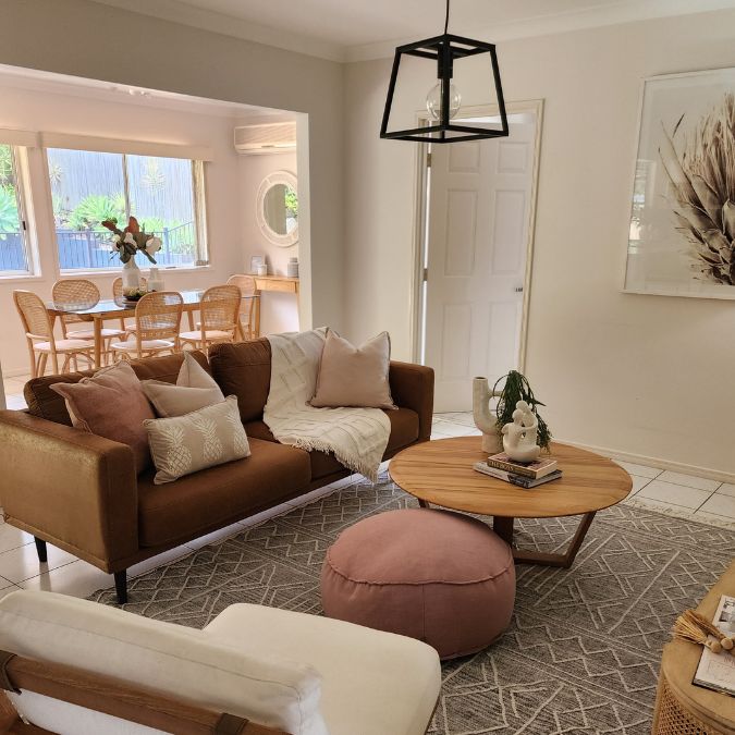
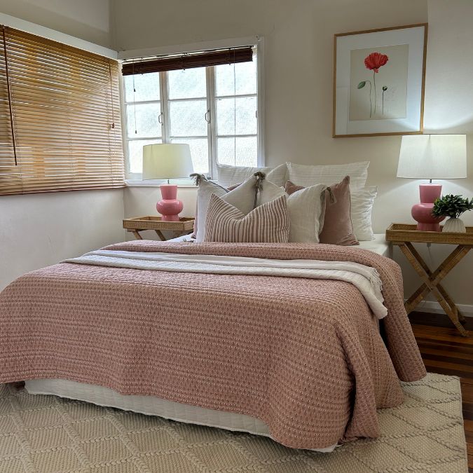
We love pink in property styling because it has the same transformative power as cream or white. Just like its neutral counterparts, it has the ability to lighten and brighten a home. So pink helps in creating an illusion of spaciousness and radiance. And that’s not to say styling with pink is limited to the kinds of properties we’ve discussed today. We love to use it in contemporary homes and apartments as well, because it is such a versatile shade!
")
")
")
And if you’re looking to brighten up your home with a hint of colour, but pink still isn’t your thing, have a read of this blog post about styling with green!


Facebook Comments