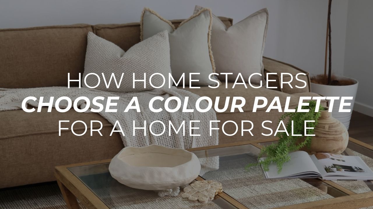
How home stagers choose a colour palette for a home for sale
“How do you decide what colours go into my home?”
It depends on what’s already there. There’s a formula behind every palette we choose, and after more than 8,500 homes across Brisbane and the Gold Coast it’s a consistent one. But the starting point is always the home itself: the furniture staying in it, the paint on the walls, and the finishes that can’t change before it’s listed.
Phoebe Shorter, our co-director, walks through how our stylists make those calls in the episode below. Here’s the short version.
It starts at the consultation
On consultation day a Foxy stylist walks through the property, takes photos and talks with you about the home. The conversation goes one of two ways, depending on whether we’re working with your furniture or styling a vacant home.
If you’re still living there, we’ll use some of your pieces. Nearly every home has something we can work with: an entertainment unit, bedside tables, a dining table, an outdoor setting. We then bring in the pieces that make the biggest difference at an open home, like occasional chairs, floor rugs, upholstered dining chairs and woven outdoor chairs. Which of your pieces stay and what we bring in is laid out in the quote, so you know before install day.
What sets the palette
Your furniture leads
If your sofa or dining chairs are staying, they decide the direction for the rest of the home. Beige furniture means we bring in more cream and beige. Grey furniture means more grey, and usually more contemporary pieces, so every room reads as part of the same home.
Grey or beige, never both
The fixed finishes matter just as much. If your walls are grey, the larger pieces we bring in will be grey too, not cream or beige. Grey and beige clash in listing photos, so we stick to one or the other.
Then a layer of colour
Once the base is set, we add colour on top. If there’s green on your sofa, green carries through the home. If your pieces are all neutral, we look at benchtops, splashbacks and features like stained glass windows to decide what colour to bring in.
We’ll always hear you out if there’s a colour you love. But we style the home to sell, so if a palette won’t do the property justice, we’ll tell you. A 1970s brick home isn’t going to present at its best as a blue and white Hamptons house.
Vacant homes follow the setting
A vacant home gives us more freedom, so the palette follows the home and where it sits. A new build with ochre and white might go Scandinavian. A bayside home suits a coastal palette. In the hinterland we lean towards a cottage feel.
The idea is that the home looks like it belongs where it is. If a buyer is looking for a seaside lifestyle, the home should show them what that looks like.
The colours we avoid
The bolder the colour, and the closer it is to a primary colour, the less likely we are to use it. Navy with banana yellow, or bold red with bright green, doesn’t photograph well. Blush pink with sage green does.
You’ll rarely see yellow in our styling, and you won’t see a very bold blue. You’ll see a deep navy or a soft baby blue instead.
Pink and black is another pairing we steer clear of. The contrast is too high, the same reason you rarely see the two worn together. Once listing photos are processed, the line between high-contrast colours tends to blur and the images aren’t as sharp. The listing photos set the first impression, so we don’t take the risk.
What’s on trend right now
Trends move. We went from pastels to tobacco and rust, then sage green, which has deepened towards olive. Right now it’s chocolate: chocolate velvet, chocolate linen, even polka dot chocolate. Phoebe expects chocolate paired with baby blue to come through for Christmas.
Neutral doesn’t have to be boring
Neutral styling is boring when everything is the same colour and texture. It gets interesting when the textures and shades vary: cream, beige, white, ivory and a little tan, with leather, crochet and macrame in the mix. Our sister company Blink Living styles mostly neutral homes on the Sunshine Coast, and texture is what makes their listings stand out. It also lets the view do the talking.
If you’re painting before you sell
Remember that you’re not the one buying the home. Paint is not the place for personal colour choices.
- If your carpet, splashback and bathrooms lean grey, go with a soft grey or a cool, blue-based white. Lexicon Half is a good example, though it can throw a little blue in the afternoon light.
- If your home has a warmer, more natural feel, a natural white works well. The warmer and darker the white, the more dated the home will feel.
- Skip feature walls.
- Avoid wallpaper wherever you can. It’s a very personal choice, best left to the people who’ll live there for good.
Want to know what your home needs?
On site, we can’t always say exactly which pieces will go in, because it depends on what the property needs. A Foxy stylist will meet you at the property, talk through what will make the strongest impression on buyers, and send you a plan and full quote within 24 hours. Book a free consultation.